Search Screen Basket
The Search Screen basket is used to temporarily hold a group of objects for the current user. Objects selected from search results are added via the Actions menu (defined in the Search Screen Actions topic here) before being published or moved into a collection.
Prerequisites
The basket functionality requires the activation of the 'ui-basket' component as defined in the SPOT Program topic in the System Administration documentation here.
Once activated, the basket button ( ) displays automatically on the Global Navigation Panel when new Web UIs are created and when the Global Navigation Panel is added to a Web UI. See the Global Navigation Panel topic in the Main Properties section here.
If using the superseded Web UI Corner Bar, follow the steps in the Corner Bar Component topic (here) to update the ---[MAIN]--- properties page, add the Corner Bar Basket child component to the Corner Bar properties. Using the Global Navigation Panel is recommended since the Corner Bar components will be removed in a future release.
For information on related components for use by data stewards, see the Data Enrichment Components topic in the Search Screen section of the Web User Interfaces / Web UI Getting Started documentation here.
Basket Dialog
Objects are added to the basket using the 'Add to Basket' option on the Actions menu as defined in the Search Screen Actions topic here. To display the basket dialog, hover over the basket button. To close the basket dialog, click an option on the basket or click outside of the basket dialog.
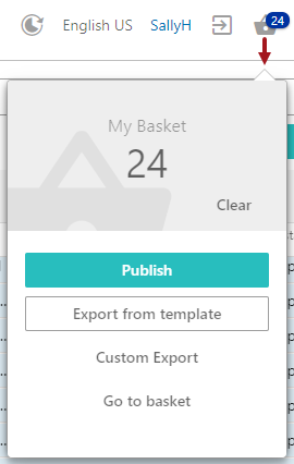
The number of objects in the basket is displayed on the basket button and at the top of the basket dialog. The Clear button removes all objects from the basket.
The actions available for the contents of the basket are defined in the sections below.
Publish
The 'Publish' option starts a wizard that enables you to send the basket contents to a selected PDS (Product Data Syndication) channel. For more on PDS, see the Product Data Syndication topic in the Data Integration documentation here.
For access to channels, the user must have an email address in STEP that matches their email address in PDS. This is required to correctly filter channels displayed in the Publish wizard. To add an email address, see the Working with Users topic in the Users and Groups section of the System Setup / Super User Guide documentation here.
If a user has no email address in STEP, this error is displayed:

If a user has an email address in STEP that doesn't exist in PDS, this error is displayed:

For information on using a sufficiency business condition and two business actions to identify products that meet your data standards and then only publishing those sufficient products to PDS, see the Publishing Only Sufficient Products to PDS topic here.
To publish data to PDS channels:
- Complete the one-time setup steps to access the PDS Export Wizard, as defined in the Setting up the PDS Export Wizard Screen topic here.
- Add objects to the basket, and on the basket dialog click the Publish button to display the Publish dialog.
Note: Click the Cancel button on any wizard step to discontinue the publishing process.
On the Select Channel step, channels and sub channels are displayed in a nested structure.
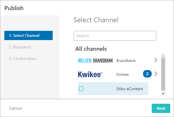
- Search for and select one or more channels from the list and click the Next button.
- Click the right arrow button (
 ) to open the nested structure of sub channels available for each primary channel.
 - Select an individual channel or, after displaying the nested sub channels, use the All or None selection links (
 ) to update the selections. Selecting a channel is reflected by the count (
 ) displayed on the 'All channels' page.
 - While on a sub channel, click the left arrow button (
 ) to go back through the nested channel structure, ultimately returning to the 'All channels' page.
- When the selected channels are managed by vendors, the optional Recipients step is displayed, supply the required data and click the Next button or click the Back button to return to the previous step.
- On the Confirmation step, review the publishing action that will be performed. Click the Publish button if you approve of the action, or click the Back button to modify previous steps.
Note: The basket contents are emptied when the publish action is completed.
- Verify the results of the publishing action:
- Success indicates that all products have been accepted for submission to the channel.
- Submitted with errors indicates that only some products have been accepted for submission to the channel and others failed on a validation level.
- Communication error indicates that there is a problem with the environment setup or that the user is missing an email address in STEP.
Note: For channels managed by a vendor, when at least one product was accepted for submission to the channel, a link is displayed. Click the link to download an Excel file with submission status information.
Export from template
The 'Export from template' option exports the basket contents using a template previously defined in the workbench. For more information, see the 'Export Action' section in the Action Buttons topic within the Web User Interfaces / Web UI Getting Started documentation here.
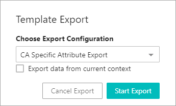
- On the basket dialog, click the Export from template button to display the Template Export dialog.
- On the Choose Export Configuration parameter, from the dropdown, select an export configuration. All saved export configurations are displayed. For more information, see the Maintaining a Saved Export Configuration topic here.
- On the 'Export data from current context' checkbox, use the following information to determine if the checkbox should be checked.
- By default, STEPXML and Advanced STEPXML configurations export data from the current Web UI context.
- By default, non-STEPXML configurations export data from the context saved in the export configuration. To overwrite the configuration context and export data from the current Web UI context, check the 'Export data from current context' parameter.
- Click the Start Export button to start the export background process or click the Cancel Export button to terminate the export process.
If configured, the user can track the progress of the export with the Background Process Notification component and/or the Background Process List Screens. For more information, see the Background Process Notification Component section
To assign a new file name in Web UI, once the file name is displayed as a background process with status 'Succeeded,' right-click the file name link and choose Save Link As option to provide the desired file name.
Custom Export
The 'Custom Export' option allows you to display the Custom Export dialog and create an export of the basket contents. No configuration is required for the Custom Export when used from the basket, but it can also be used elsewhere in the Web UI. For more information on configuring the Custom Export in other Web UI screens, see the Custom Export Action topic here.
Custom Export Dialog
The numbered items in this dialog are defined below:
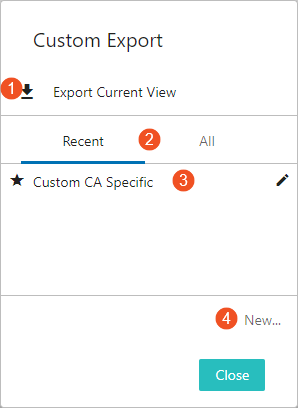
- Export Current View - Click this button to initiate an export of all table data into a .csv file with no customization.
- Recent and All - Click the Recent tab or the All tab to display a list of saved custom exports.
- Saved custom exports - Click the row of a saved export (such as 'Custom CA Specific' shown above) to display the 'Edit export' dialog (shown below). This allows you to review the export settings and start the export. Right-click the edit button (
 ) to display Edit, Delete, Rename, and Share options. If shared, the export configurations can be reused by all members of the designated user groups.
 - New... - Click the New... button to display the 'Custom Export; dialog (shown below) and to define a new custom export.
The Close button closes the dialog without initiating an export.
Configuring a Custom Export
The 'Custom Export' and the 'Edit export' dialogs include the same parameters to define the export data.
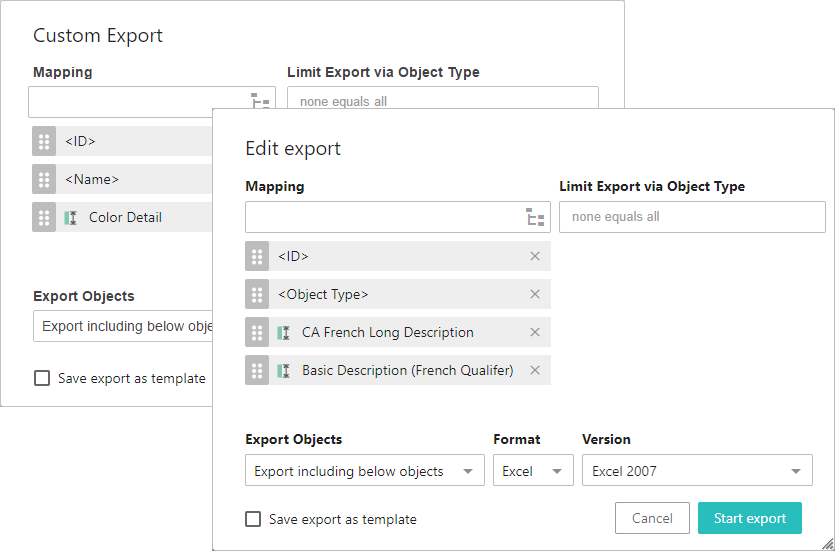
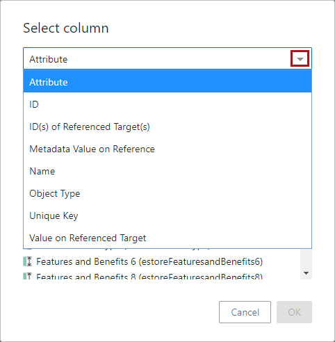
- For the Mapping parameter, use the typeahead field to search for attributes by name, or click the node picker button (
 ) to display the Select column dialog (shown below) to select the type of item for mapping from the available options. Use the dropdown to set the item and display additional options based on selection. See the Example section below for more information.
Once added, the new mapping can be reordered by clicking and holding the sort button ( ), dragging to the desired place in the list, and then releasing the button. The screenshot below shows the kinds of headers users can include in their custom imports. Below the screenshot is a list of the available column types.
-
Attribute - When selected, users are prompted to select the desired attribute from those configured on the system. The selected attribute's value displays in a column named after the attribute. This is the default column type.
-
ID - Displays the ID of the listed objects in a column with the header 'ID.'
-
ID(s) of Reference Target(s) - Displays the ID of a target object referenced by the source object. For instance, if Acme SmartPhone is the object listed in the table, and Acme SmartPhone references Acme Headphones, the ID of Acme Headphones will display in this column.
-
Metadata Value on Reference - Displays a value of an attribute on the reference that links the listed source object to the reference target object. For instance, if the reference connecting Acme SmartPhone to Acme Headphones has on it a metadata attribute related to Bluetooth compatibility, then the value of this metadata attribute will display in this column. Users have the option to also include the Reference Type name to display alongside the metadata value to help users differentiate between similar values across multiple Metadata Value on Reference columns. This can be done by checking the 'Include reference type in header' setting when configuring this header.
-
Name - Displays the 'Name' value of the selected objects in a column with the header 'Name.'
-
Object Type - Displays the object type of the listed object in a column with the header 'Object Type.'
-
Unique Key - If a unique key is configured for the listed object, the unique key will display in a column with the header 'Unique Key.'
-
Value on Referenced Target - Displays a value of an attribute on the referenced target object. For instance, if the source product is Acme SmartPhone and it references a target object called Acme Headphones, and the requested data is the value of the 'Color' attribute on Acme Headphones, then a color value like 'Metallic Gray' would display in this column. Users have the option to also include the Reference Type name to display alongside the referenced target value to help users differentiate between similar values across multiple Value on Referenced Target columns. This can be done by checking the 'Include reference type in header' setting when configuring this header.
- For Limit Export via Object Type, the exported objects can be limited further by choosing specific object types to be exported. Click the parameter to display a list of all the object types in System Setup. If nothing is added to this parameter, the export is not limited by object type.
- For Export Objects, the user can choose which objects to export:
- Export including below objects
- Export only leaf objects
- Export only selected objects
- For Format, select an export format: Excel or CSV. If CSV is selected, the user can choose which delimiter to use (if the default configured in the Custom Export Action designer is not applicable for the given job).
- For Version, choose an Excel version to be used. It is recommended that the newest supportable version of Excel is used. The default is Excel 2007.
- For Save export as template, check the box to name the export, retain the settings, and display it for selection on future custom exports.
- Click Start Export to begin the background process or Cancel to leave the dialog without saving.
The exported file is automatically named. For example, 'excel-2020-07-24_11.12.27.xlsx' where 'excel' indicates the file type (Excel and CSV are the only options for this action), '2020-07-24_11.12.27' is the timestamp of the background process as YYYY-MM-DD_HH.mm.ss. To assign a new file name, once the file name is displayed in the Background Process Node Details Screen as a background process with status 'Succeeded,' right-click the file name link and choose Save Link As option to provide the desired file name.
The file name is also used as the process description and can be viewed in the Web UI Background Process Notification Component topic (here), in the Background Process List Screen topic (here), as well as in the BG Processes tab in workbench (as defined in the BG Processes Tab topic in the Getting Started / User Guide documentation here).
Example
For example, when the attribute option is selected, three tabs are displayed to help you find the required attribute. Suggestions are given based on a sample of the objects in the beginning of the selection. Under the 'All' tab you can browse through all the attributes in the system. Finally, you can search for a given attribute under the 'Search' tab.
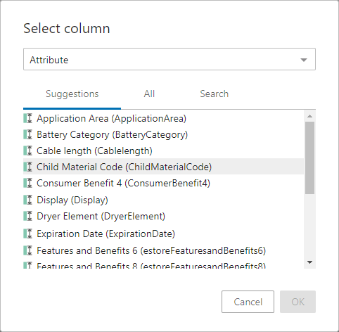
If you select ID, Name, or Object Type, no additional information is required. Click OK to return to the previous dialog.
Go to basket
The 'Go to basket' option displays the basket contents in a Basket Screen using a Node List view where additional actions can be performed as allowed.