Open topic with navigation
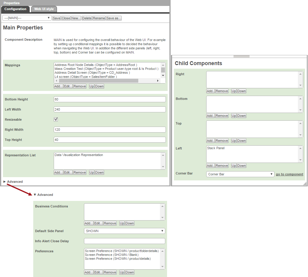
Main Properties
The Main Properties configuration determines the overall behavior of a Web UI.
All the steps provided in this topic assume the Web UI designer is in design mode and on Main Properties prior to starting the configuration process. For more information about getting started using a Web UI and details about design mode access / usage, see the Web UI Getting Started documentation here.
Configuring the Parameters
Mappings
Screens display in Web UI based on the Mappings values. When a new screen is created, typically a mapping also needs to be set up. The mappings are shown as 'screen ID (condition)' for the Mappings parameter and are evaluated one-by-one in the order shown. When the first mapping condition is met, the evaluation stops, and the screen configured for that condition is displayed. If no mappings match, then the default target screen is the Homepage.
The mapping order should be evaluated based on your system and all efforts should be made to avoid mapping conflicts (e.g., multiple mappings that use the same condition but different screens).
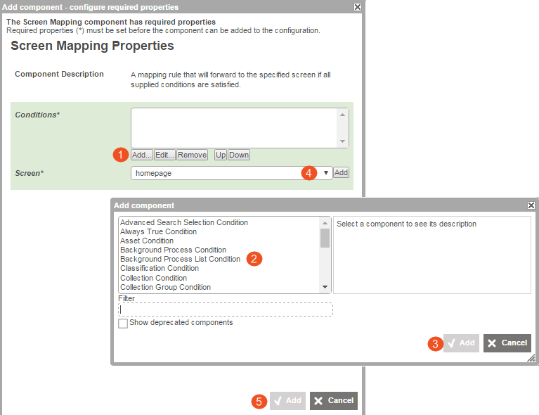
- Click the Add... button for the Mappings parameter.
- Make a condition selection by clicking the Add button under the value field box.
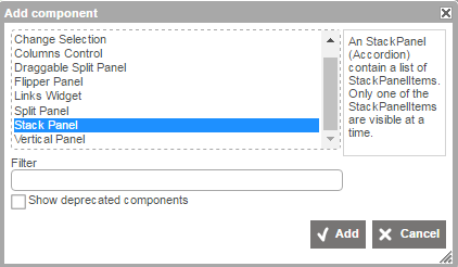
- Within the 'Add component' dialog, click on a component name to see its description. Make a selection by clicking on a component, and then clicking Add.
- Additional properties screens may display if additional parameters need to be configured for the condition selected (e.g., Object Type, Workflow). As needed, make parameter choices and click Add.
- Back on Screen Mapping Properties, repeat steps 2, 3, and 4 to add multiple conditions to the value field, if applicable. Note that all the conditions for an individual mapping will need to be met for the mapping to apply.
- Make a Screen selection using the dropdown selector. (If the desired screen does not already exist, click Add to the right of the Screen dropdown and follow the steps to create a new screen. Configure the new screen after saving the Main Properties.)
- Click Add.
- If needed, edit existing Mappings selections and/or re-order the mappings using the Up and Down buttons.
- Click Save in the designer to save the current settings. Do not close the designer unless you have finished configuring all the other parameters (outlined in the rest of this topic).
Note: When navigating through Web UI, the first condition / screen mapping that applies takes precedence over any other valid mappings applicable to the selected object. If encountering the incorrect screen when navigating Web UI, check the condition / screen combinations and rearrange the mappings as needed.
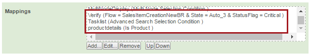
Example: You are using Advanced Search. After doing a search, you click on an object link in the results list. This object is a product and is currently flagged as critical in state Auto_3 of the SalesItemCreationNewBF workflow.
Although the object is a product and you are making a selection within a set of Advanced Search results, you will navigate to the Verify screen. This is because that is the first condition met from within the mappings list. While three mappings are applicable for this one object, the first mapping takes precedence over the other two.
Height / Width Settings
The height and width settings apply to the components set up to display as Child Components in Main Properties (described in detail later in this topic). The default pixel value for height and width settings varies depending on the template used when originally creating your Web UI.
The screenshot below shows the default pixel settings shared by the Web UI templates. The Left Width default may vary slightly (240, 280, 300) depending on the template used. All can be adjusted as needed.
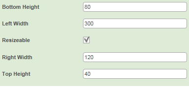
- Bottom Height: Determines the height of a component added to the Child Component > Bottom. The component is placed on the bottom of the screen and expands up. The greater the number of pixels, the taller the component.
- Left Width: Determines the width of the component added to the Child Component > Left. The component is placed on the left side of the screen and expands out to the right.
- Resizeable: Applies to all child components configured in Main Properties. When enabled, a drag handle (shown in the next screenshot) appears so that the child component can be resized manually; the resizing takes effect for a single screen session and the height / width parameter settings apply again automatically upon the next log in. If disabled, the drag handle does not display on the screen nor does the tab used to expand / collapse the component. Note that if the Advanced > Default Side Panel parameter is set to COLLAPSED, disabling this setting will create an error when clicking Save in the designer window. This is intentional to make the user reevaluate the settings selections, since these two settings should not be used together.
- Right Width: Determines the width of the component added to the Child Component > Right. The component is placed on the right side of the screen and expands out to the left.
- Top Height: Determines how far down from the top of the screen the left and right child components are placed; the higher the number, the more space there is from the top of the screen to the top of the components. An example follows.
In the screenshot above, the stack panel on the left is shown with a Top Height setting of 20 and Resizeable is enabled. The stack panel shown on the right side of the screenshot has a Top Height of 40 and Resizeable is disabled, so there is not a drag handle nor a tab visible to the right of the stack panel.
Representation List
The Representation List parameter is part of the Data Visualization functionality within Web UI. The object type and reference settings can be made one time using the Data Visualization Representation component and applied anywhere a Display Relations Screen is used.
If a Display Relations Screen type is not in use anywhere in the Web UI, then skip this parameter.
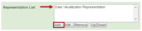
- Click the Add... button under the value field.
- Double click the Data Visualization Representation title that populates the value field and configure the Data Visualization Representation Properties.
- Click Save in the designer to save the current settings. Do not close the designer unless you have finished configuring all the other parameters (outlined in the rest of this topic).
For full details on how to configure this parameter and the subsequent component, see the Data Visualization section in the Web User Interfaces / Using a Web UI documentation here.
Advanced
Click on Advanced to expand the screen to display additional parameters. A description of each parameter follows. Configure each to fit your business needs.
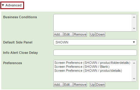
- Business Conditions- Any business conditions added here become global conditions. This means that the conditions will be evaluated together, as applicable, with any additional business conditions configured for a screen, component, or parameter that you may be working with. For more information about business conditions, see Business Conditions in the Business Rules documentation here. To add a business condition to the value field:
- Click Add... and then configure the Business Condition Properties that display.
- Click Add to apply the condition.
- Repeat steps 1 and 2 to add multiple conditions.
- Default Side Panel - This setting determines the behavior of the Left child component on all the pages within Web UI. Make a selection using the dropdown. An explanation of each option follows. This is an all-or-nothing setting but may be overwritten for certain screens based on the Advanced > Preferences configuration.
- HIDDEN: Default setting; The component will not automatically display on the screen.
- SHOWN: The component remains static on the left side of the screen as you navigate through Web UI.
- COLLAPSED: The component does not automatically display on the screen but is accessible by clicking on a tab (
 ) shown on the left side of the screen. Note that if the Resizeable parameter is disabled, choosing COLLAPSED will cause an error message to display when clicking Save in the designer window. This is intentional to make the user reevaluate the settings selections, since these two settings should not be used together.
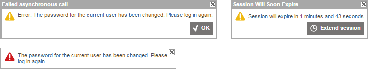
- Info Alert Close Delay: When set, info alert boxes, like those show below, will automatically close after the specified time (seconds). If the value field is blank, then info alert boxes will remain on the screen until the user manually clicks the close button on the message box.
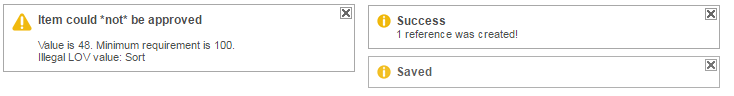
If an alert requires a user action such as clicking a button to make a decision or acknowledge a message, or if the alert is a warning requiring action by the end user (e.g., fixing a validation error, re-logging in), then the close delay value does not apply. A few examples of these alert types are:
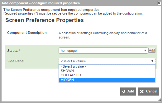
- Preferences - Use the Preferences parameter to overwrite the Default Side Panel settings for specific screens. As an example, you may decide that it is best to display the Left child component on some screens (e.g., Homepage) although the Default Side Panel parameter is set to HIDDEN.
- Click Add... and make or select a Screen and Side Panel setting on Screen Preference Properties.
- Repeat to add additional screen preferences.
Child Components
Add components to each screen using the Child Components section of Main Properties.
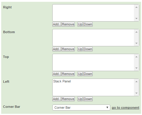
- Right, Bottom, and Left: When using a Web UI created from one of the standard templates, the Left parameter is already configured by default. The default value can be removed or additional selections can be added.
- Click Add under any of the parameter value fields, and an 'Add component' dialog will display with options. Clicking on a component name will display information regarding what that component does.
- Click Add to select a component and set parameters as needed. Configure any other parameters that may display in additional dialogs based on the component selected.
- Click Add again to add the component.
- Repeat steps 1, 2, and 3 to add multiple components under a single child and/or add components to another child.
- Top: Use the Corner Bar parameter (described below) in place of using this component.
- Corner Bar: Set up the Corner Bar to get a 'mini menu' of quick navigation options that will display in the top right of the non-Homepage screens. Follow these steps:
- Choose Corner Bar from the dropdown.
- Click on go to component and in the 'Add component' dialog, make a selection and click Add again.
- Configure any additional properties (e.g., Corner Bar Simple Search Properties) that require additional parameter selections.
- Repeat steps 2 and 3 as desired.
- Click Save in the designer and click Close to return to normal Web UI operation.
Examples of Component Usage
Child Components Example
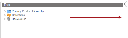
Here is an example of what a Stack Panel can look like when added to each relevant child component. Each tree component is set up to display different nodes.
- Left: Stack Panel configured to display two Stack Panel Items: a Tree Navigator (user-titled as Tree) and a Status Selector Sidebar Widget (user-titled as Status Selector).
- Right: Stack Panel configured to display a Stack Panel Item > Tree Navigator (user-titled as System Setup).
- Bottom: Stack Panel configured to display a Stack Panel Item > Tree Navigator (user-titled as Child Component Bottom Parameter).
Configuring the screen like this (see below) may not be ideal since it does not leave much room for working with the data. However, it does provide an example of how the Main Properties > Child Components will be displayed to an end user.
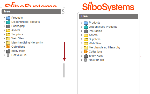
The configuration order for the Right component (System Setup) is shown directly below. The Tree Navigator component is configured as the Stack Panel Item added to Stack Panel Properties. Two root nodes are selected to display. Note that if no node selection is made, then all the nodes will display.
The Bottom component is configured similarly to the Right one. The only difference is that different nodes are selected to display.
The Left is similar to the Right and Bottom, with different nodes. There is also an additional Stack Panel Item configured to display (Status Selector Sidebar Widget).
For step-by-step instructions on how to add the Tree Navigator Component to display in the Web UI, see the Tree Navigator Component document in the Web User Interfaces / Using a Web UI documentation here.
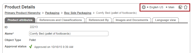
Corner Bar Example
Here is an example of a configured Corner Bar. The symbols shown in the Corner Bar (left to right) correspond with the Corner Bar Properties > Child Components > Items values (top to bottom). Each icon is easily identifiable to the end user as hover text displays when mousing over each icon.
The up arrow icon (shown below) on the far right is a standard icon that will display even if the Corner Bar is not selected / set up in Main Properties. Clicking this icon will take you to the Homepage.
2017, Stibo Systems