The toolbar, which runs horizontally above the perspective tabs, holds the bulk of the functionality available in the perspectives. The toolbar buttons display contextually, meaning they display based on the perspective being viewed or the actions taken by the user. This results in display of only those options likely to be related to the tasks at hand.

For instance, when viewing a collection, the 'Assign' button does not display, as the 'Assign' button can only be used to assign tasks to other users. As tasks do not reside within collections, there would be nothing to assign. Further, while viewing an appropriate perspective (Tasks perspective in this case), the 'Assign' button will not be active (clickable) until at least one item has been selected, as a task upon which to execute the action must first be indicated in order to assign it to a different user.
Each button available in the toolbar is listed and described below, with links to button-specific topics if available. Additionally, all topics related to the toolbar buttons can be found beneath this topic.
Each button is available in the Browse, Tasks, and Collections perspectives, unless stated otherwise.
-
Sort - Enables users to sort the table data in alphabetical order based on any selected column. Details can be found in the Sorting topic.
-
Filter - The Filter toolbar button allows users to manage the display of data in a table to present the information in a more meaningful way. For example, if a user wants to show only list items that have content in a specific column, they may select the relevant column, select the 'Not Empty' option from the condition dropdown, and apply the filter. Go to the Filtering topic for more on this functionality.
-
Create - The Create toolbar button allows users to create a new object and immediately initiate that object into a workflow within a Tasks perspective. Go to the Creating and Initiating a New Object within the Tasks Perspective topic for more on this functionality.
-
References - The '+' (Add) button is for adding references. The '-' (Remove) button removes a selected reference. 'Remove' is also an option under the Items > References menu and only becomes enabled (in both places) when working within an existing reference in a reference table. Go to the References topic for information on reference tables.
-
Inspect - This action allows you to inspect the details of selected references.
-
Submit - Allows users to submit a selection of one or more items in the table to the next step in the workflow. Available in the Tasks and Browse perspectives.*
-
Add to workflow - Make a selection from the table and click the Add to workflow button to display a dropdown containing the names of all workflows configured on that system. Locate the desired workflow and click it. The selected items are then added to the workflow. Workflows listed in black text can be submitted to, while those in gray cannot. Available in the Tasks and Browse perspectives, as well as the Search screen.*
-
Assign - When viewing workflow tasks in a Tasks perspective, users can select tasks / items in the table, and then assign them to themselves, other groups, or other users. This button is only available in the Tasks perspective.*
-
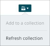
Collection - This dropdown allows users to handle collections in the following ways:
-
Refresh collection - This action is specifically designed for search-based collections. This action updates a search-based collection to reflect the latest data in the system. When you click refresh, the system re-runs the original search criteria associated with the collection, removes all previously linked nodes, and adds the updated set of nodes that match the search results. Use this feature when the underlying data has changed and you want the collection to include the most current nodes. This option is available only for search-based collections and not for static collections or collection groups. The refresh process runs in the background, so updating large collections may take some time. Once the collection has been refreshed, the user receives a notification. Clicking the Go to perspective link in the notification takes the user directly to the updated collection.
-
Master product - These actions allows users to manage master product families and add products to them. Refer to the Managing Master Products topic for more details. Available in the Tasks, Browse, and Collection perspectives. This button will only appear for users of the Accelerator for Retail solution.
-
Categorize - Select one or more products to move to another locations in the product hierarchy. Refer to the Categorizing Objects topic for more details. Available in the Task, Browse, and Collection perspectives. This button will only appear for users of the Accelerator for Retail solution.
-
PDX channels - Clicking this option allows you to select 'Add to PDX channel' or 'Remove from PDX channel' to one or more products in perspectives table. The PDX channel solution in Instrument supports business processes to be executed before the actual syndication takes place. Refer to PDX Channels Setup for more details.
-
Business action - With one or more items selected from the table, click the Business action button to apply a pre-configured business action to that selection. The Business action button's dropdown displays business actions that can be applied to the item(s) in the selection. Business actions listed in black text can be applied to the selection, while those in gray cannot. Hover the cursor over each business action for additional information. Find the desired business action and click it. Subject to the business rule configuration and the selected items' suitability, the items in the selection will then have the business action applied to them. Available in the Tasks and Browse perspectives, as well as the Search screen.*
Note: Admin users have the ability to determine which business actions are available to users when the Business action button is selected. Information can be found in the Setting Business Action Availability topic in the Administration section.
-
Approve - Select one or more items to enable and use the 'Approve' button. Go to the Approving Data topic for more about approving items and selection maximums that apply to this action.
-
Export - Make a selection from the table and click the Export button to export (based on an export configuration) the configured attributes and references displaying on the screen. The export is sent to a background process where it is listed in the notification center. Click the 'Download file' link at the bottom of the export listing to open the file with the exported data. Refer to the Exporting Data topic for more details and important information around selection maximums that impact this action.
-
Import data - Using an import configuration, import product data by uploading an import file. A background process is created that imports the data. Any applicable notifications are shown in the notification center, and an execution report provides you with import details (including any error info, if applicable). Refer to the Importing Data topic for more details.
-
Zoom level - Users can specify the height of each row in the table by adjusting the zoom level. Doing so may reveal more information that may otherwise have been hidden if contained within a smaller cell.
-
Customize - This toolbar button opens a dialog that enables users to configure their view of the table by selecting which columns to display. Refer to the Customizing Columns topic for more on this functionality.
-
Details - Allows users to toggle between a list view (default) and a details view. The list view shows a list of items in a table, while the details view lists the items in a column on the left side of the screen and shows product details on the right side of the screen.
*This action has a limit of 50 items and will be disabled when you have more than 50 items selected. This limit is only temporary and will be increased in the future.