A Node List component displays objects in a table / grid format. The view can be further customized by configuring the data to display via different display modes and adding different action buttons that users can click while working with the object data. The display modes can then be customized with a range of headers, allowing for different information about the listed objects to be displayed. The behavior of many of the various actions can be further configured, also.
A Node List can be added as a child component of various other components including, but not limited to, Multi Reference, Packaging, Task List, Display Children Screen, Collection Content, and Advanced Search.
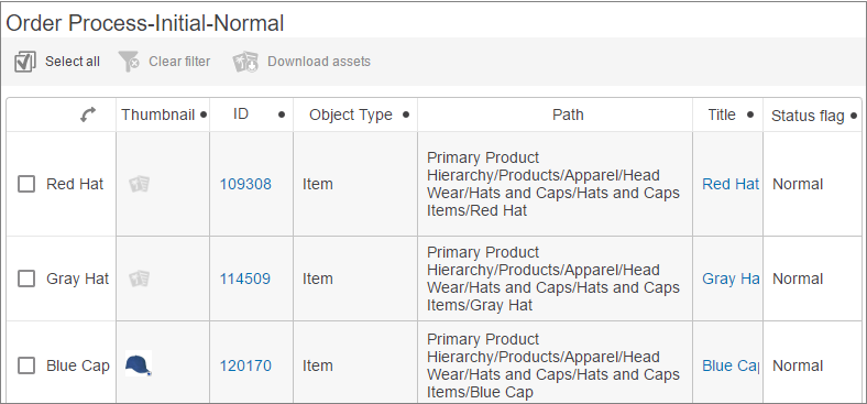
Below is one example of a Node List (configured as a child component within Task List Properties).
Specific details on setting up this particular Node List can be found in the Multi-Reference Editor topic. General Node List configuration instructions can be found below.
Prerequisites
It is expected that anyone configuring the Node List component is familiar with the Web UI Designer, as basic concepts for working with the designer are not covered in this section. In addition, the user must have appropriate privileges to access the designer. Additional information can be found in the Designer Access topic.
Configuring Node List Master Component Properties
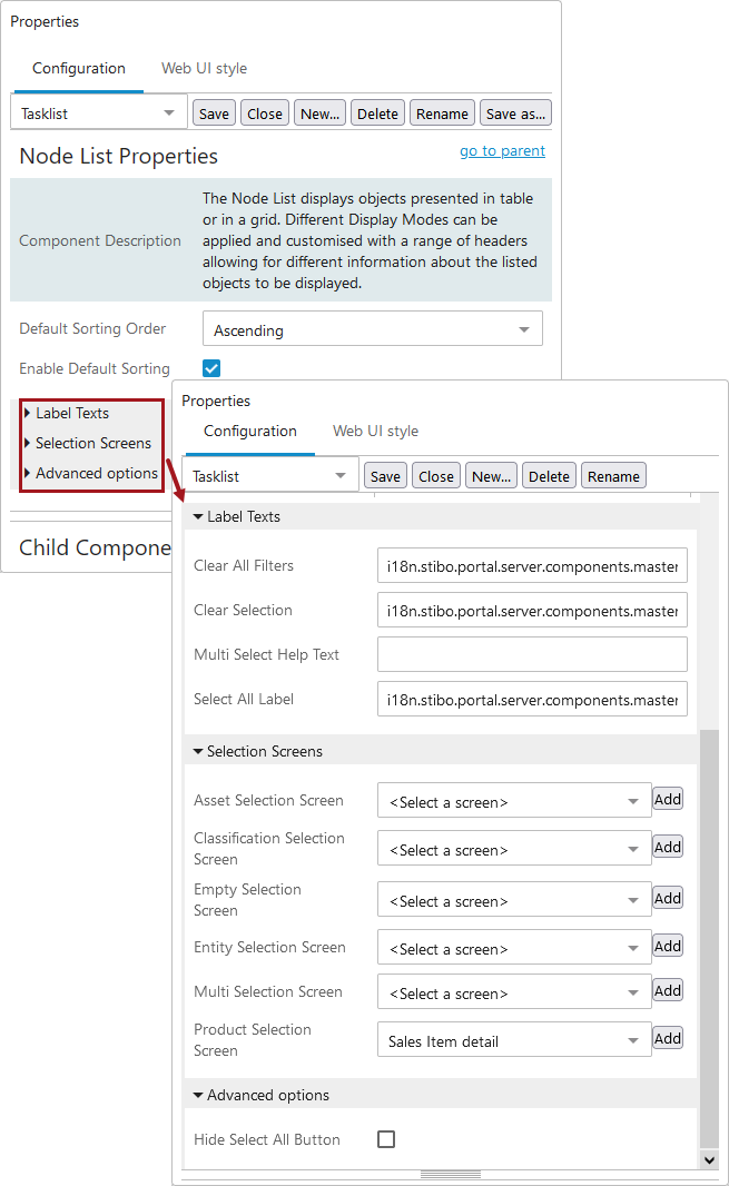
A Node List is highly configurable. Each parameter in Node List Properties features help text, accessible by hovering over and clicking the info icon to the right of each parameter name. The default parameter settings may differ depending on where a Node List is used. The following screenshot shows another example of a Multi Reference Properties Node List.
Follow these steps to configure the component:
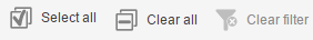
- Enable or disable Hide Standard Buttons, as desired. When enabled, the 'Select all,' 'Clear selection,' and 'Clear all filters' buttons display above the table.
- The only mandatory parameter is ID. A descriptive, unique ID can be given or the standard pre-filled text can be kept. The STEP system uses this ID to recognize which Node List to display.
Note: By enabling the 'Include Labels' parameter, all toolbar actions on the screen will be displayed with a label beneath the icon.
- Either enable or disable Lookup Screen Type For Navigation based on the desired behavior, outlined below:
- If unchecked, then the object screen selection that is defined under Selection Screens will be used as a target screen (e.g., Asset Selection Screen, Classification Selection Screen, Product Selection Screen, and Entity Selection Screen).
- If checked, then the screen mappings that are defined in the Main Properties are used when selecting the object from the Node List.
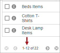
- When using Table Display Mode (List view), Film Strip Display Mode (Filmstrip view), and Gallery Display Mode (Gallery view), the objects in the table are displayed by page. You can determine the maximum number of objects to show per page. Change the number in the Page Size field or use the default (50 objects per page).
Note: Setting Page Size to a number higher than 100 may result in system performance issues.
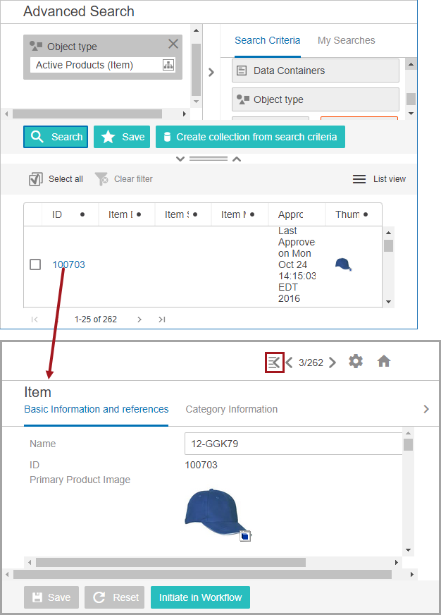
- Determine how the object data should be displayed when you click on an object ID link in a Node List. You can either view the object details directly on the same screen by enabling the Use Details Overlay parameter—or view the object details on a different screen. Both methods use the same screen mappings (dependent on how you have set up the parameters) and display the same information. To better explain, below are two examples, both using the Advanced Search screen type:
A user runs a search and then clicks on ID 101117 that is shown in the results list, which is a Node List in List view.
- Example 1: Use Details Overlay is disabled (unchecked), so the screen navigation takes the user to the Item Details screen.
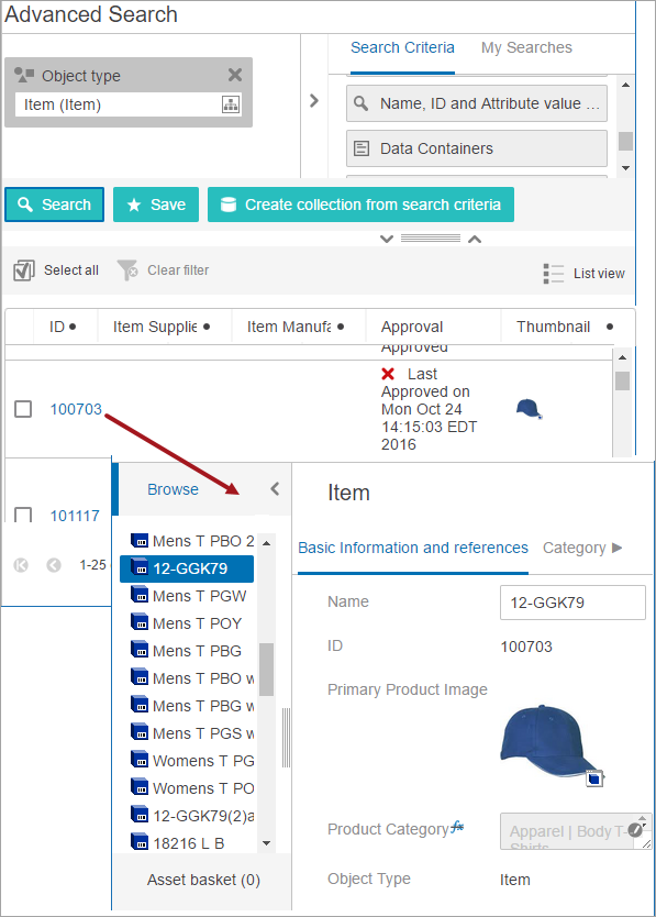
- Example 2: Use Details Overlay is enabled (checked), so the Item Details screen displays as an overlay on the Advanced Search screen. Users can easily return to the results list / Node List by clicking the
 icon in the upper right corner and can use the arrows to navigate through each Node List item.
- Select a Default Sorting Order option (Ascending or Descending), if desired.
- If a Default Sorting Order is selected, enable Enable Default Sorting by checking the box. When enabled, initial table sorting will be performed on the contents of the first column or row (depending on property direction) when applicable, otherwise on ID. If disabled, no initial sorting will be performed.
Note: If Table Sorting is enabled for one of the headers configured within a display mode, then that setting overrides the Node List Enable Default Sorting selection.
Access additional parameters by clicking on Label Texts.
- Under Label Texts, if desired, change the hover text displayed for one or all of the three standard buttons (described in Step 1) by typing the desired text into the Clear All Filters, Clear Selection, and/or Select All Label parameter fields.
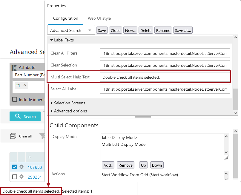
- To display text / information to a user looking at data in Table Display Mode (List view), Film Strip Display Mode (Filmstrip view), or Gallery Display Mode (Gallery view), add it to the Multi Select Help Text parameter. It is blank by default. An example follows.
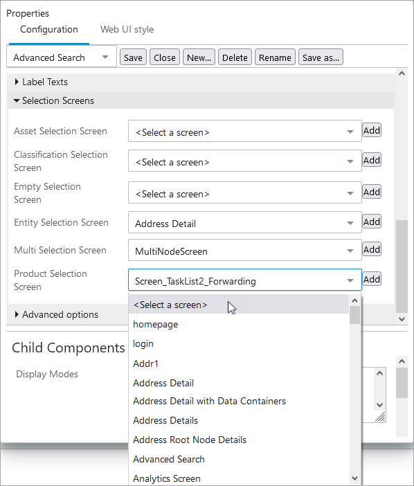
Access additional parameters by clicking on Selection Screens.
- Under Selection Screens, if you wish to override the configured Web UI mappings, make selections regarding which screen(s) a user will view after clicking on object links in the table. Using the dropdown for each parameter, select the ID of the screen to display when:
- Asset Selection Screen: A single asset is selected.
- Classification Selection Screen: A single classification is selected.
- Empty Selection Screen: The selection is empty.
- Entity Selection Screen: A single entity is selected.
- Multi Selection Screen: The selection has multiple entries.
- Product Selection Screen: A single product is selected.
Important: If using these screens instead of the Main Properties mappings, you also need to disable the Lookup Screen Type For Navigation parameter, as described earlier in this topic.
Note: When a numeric value displays for an attribute value component, default Web UI configuration will not display the commas separating the thousands. To enable display of the thousand separators in attribute value components, contact Stibo Systems Support.
Configuring Node List Child Component Properties
Display Modes and Actions are configured in the Child Components section. Each selection corresponds to a button / icon that will display above the data table. Display Modes determine how the entire Node List displays, and actions can be performed on the selected nodes and/or objects. The buttons / icons are enabled when they are applicable for use.
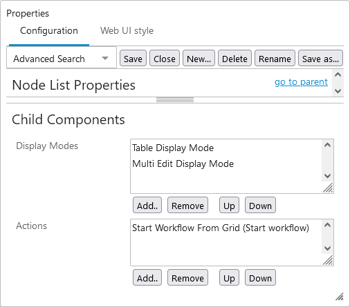
These are basic instructions for configuring each with more detail following the steps.
- Click the Add button under the parameter field.
- Make a selection in the 'Add component' dialog.
- Click Add again. New selections are added to the bottom of the list and can be re-ordered using the Up and Down buttons. The icons / buttons will display left to right on the screen in the top-to-bottom order shown for the parameter.
- Repeat steps one through three as needed.
- Double click on the display mode title in the field to configure each display mode's properties. Each display mode provides a different view of the configured content, and allows for different configuration options. For example, each display mode can be given a unique name in the 'Title' field, so that multiple view modes of the same type can be differentiated in the view mode selection dropdown located in the Node List toolbar.
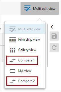
The various view modes are defined in the table below.
| Icon | Display Mode | Button Hover Text | Description | Image Display |
|---|---|---|---|---|
|
|
Compare |
Compare view |
Table with customizable headers; can change table direction and select a title to use for identifying the objects displayed; Freeze Panes can be enabled on this view; Hide Equal / Mark Different is available for this view type Configuration instructions are in the Display Mode - Compare topic. |
By adding and configuring a Thumbnail header, images for products, entities, and classifications can be displayed in a Node List. |
|
|
Film Strip |
Filmstrip view |
A single row of icons / images representing the objects Configuration instructions are in the Display Mode - Film Strip topic. |
If no reference type is defined for the 'Reference Type' parameter when configuring this view mode, the primary image for products, entities, and classifications will display automatically. |
|
|
Gallery |
Gallery view |
Grid with icons / images representing the objects; typically used for lists of image assets Configuration instructions are in the Display Mode - Gallery topic. |
If no reference type is defined for the 'Reference Type' parameter when configuring this view mode, the primary image for products, entities, and classifications will display automatically. |
|
|
Grid |
Grid view |
Configurable grid; designate what attribute value is displayed Configuration instructions are in the Display Mode - Grid topic. |
By adding and configuring a Thumbnail header, images for products, entities, and classifications can be displayed in a Node List. |
|
|
Multi Edit |
Multi edit view |
Configurable table; allows for editing of the objects; Freeze Panes can be enabled on this view; Hide Equal / Mark Different is available for this view type Configuration instructions are in the Display Mode - Multi Edit topic. |
By adding and configuring a Thumbnail header, images for products, entities, and classifications can be displayed in a Node List. |
|
|
Sequencing |
Sequence view |
Table used for sequencing children of the current object (via the Display Children Screen and Children of Types). This can be used to sequence products, classifications, products in classification folders, and attributes. Configuration instructions are in the Display Mode - Sequencing topic. |
By adding and configuring a Thumbnail header, images for products, entities, and classifications can be displayed in a Node List. |
|
|
Table |
List view |
Configurable list (vertical columns); Hide Equal / Mark Different is available for this view type Configuration instructions are in the Display Mode - Table / List topic. |
By adding and configuring a Thumbnail header, images for products, entities, and classifications can be displayed in a Node List. |


For more information on the Thumbnail Header component, refer to the Thumbnail Header topic.
Important: For the view modes described in the table above that enable configuration of a 'Thumbnail header' component, the 'Primary Image Reference Type' must be set on the 'Users and groups' node for the 'Thumbnail header' to successfully display an image. 'Users and groups' is located on the 'System Setup' tab in the workbench.
Clicking through the actions in the 'Add component' list will provide more details on what each action does. Also, many actions are explained in detail in applicable topics within the Using a Web UI documentation, as they pertain to specific functionality. Actions examples include (but are not limited to) Add Reference Action, Remove a Reference Target, Start Workflow from Grid, and Custom Export Action
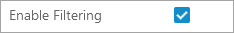
For the 'Compare,' 'Multi Edit,' 'Sequencing,'and 'Table' display modes, attributes values may be filtered by enabling the 'Enable Filtering' option on the component.
Enable Filtering
When the Enable Filtering option is selected on this component, the ability to filter based on attribute values is enabled.
To apply a filter, click anywhere in a column's header. This brings up the sorting and filtering window highlighted in the screenshot below:
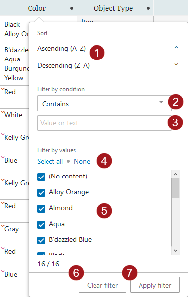
Referencing the numbered elements in the above screenshot to the corresponding numbers in the list below, functionality in the filtering window enables users to:
- Sort the attributes in either ascending (
 ) or descending (
  ) alphabetic order.
 - Filter the linked attributes by a condition to show only attributes that:
- 'Begins with' - The filter value begins with one or a sequence of characters.
- 'Contains' - The filter value contains one or a specific sequence of characters. This value may appear anywhere within a value string.
- 'Does not contain' - The filter value does not contain one or a specific sequence of characters, whether in a single-valued or multi-valued cell. This value may appear anywhere within a value string.
- 'Equals' - The filter value matches a precise set of characters.
- 'Include Only' - This filter option allows users to set a list of values separated by a delimiter, like commas, semicolons, pipes, tabs, or newlines, and if one or more of the items in the list matches, then those rows will be populated. If no items from the list are present in the column, then no results will display.
- 'Wildcard' - This filter value option will display attribute values containing a repeated set of characters that includes known variable characters that can be substituted with an asterisk '*' symbol. Wildcard may be used singularly or multiple times in a filter setting. For more information, refer to the Wildcard in Searches section of the Advanced Search Functionality topic of the Getting Started documentation.
- With any of the above filtering criteria in place, users may enter their search terms into the Search field. As characters are typed into this field, the blue-checked values that display in the filtering menu change to reflect a filtered list of attribute values culled from the column's full list of values. From these, users may select only those attributes they want to display by adding a check beside each.
The default filter setting is 'Contains.' For the settings 'Begins with,' 'Equals,' and 'Wildcard,' if a user just deselects any value in the search list, then the filter will revert to a 'Contains' filter once it is applied. For the settings 'Begins with,' 'Contains,' 'Equals,' and 'Wildcard,' any values entered that do not meet the filter criteria are removed from the filtered selection. For the setting 'Does not contain,' any rows containing values that do meet the filter criteria are removed from the filtered selection.
Note: If you are dealing with multi-valued attributes where more than one value is populated, then All Values for that attribute are considered when creating a filter. Excluding one value by a filter does not mean the attribute will necessarily be removed from the view.
- Click the 'Select all' button to ensure all listed attribute values are checked. Click the 'None' button to deselect all attribute values. When users click 'None', the 'Apply filter' button is grayed out and cannot be selected until at least one of the attribute values is selected.
- Users may also forgo the filtering and manually select from the full attribute list only those attributes they want to display by adding a check beside each. All values are checked by default.
- Quickly clear any work you have done in the filtering window by clicking the 'Clear filter' button. The configuration you have applied remains in this filtering window, even if you clear the filter on the actual attribute link table. To clear all filtering, first clear the filter from the table, and then in the filtering window, click the 'Clear filter' button.
- Apply the configured filter to the attribute link table by clicking the 'Apply filter' button.
-
Once applied, the 'Clear all filters' button displays in blue. Click this button to remove any filters applied.
Note: When a Node List contains more than the configured number of objects (the default maximum being 5,000), sorting and filtering is disabled. This is because when Node Lists contain more than the configured maximum for display, all objects above that maximum will not display. Because sorting and filtering actions applied to the displayed objects will not also apply to non-displayed objects, sorting and filtering is disabled. For example, if an advanced search result contains 10,000 results, and the user clicks a header to sort and filter the Node List based on the values in the column, it will not be obvious that all objects after 5,000 are not included in the filtering, and so the resulting list will not be accurate. When users initiate sorting and filtering on a Node List with more than the configured maximum number of objects, an informational dialog displays that reads 'Sorting and filtering on this subset of data would display inaccurate results, so they have been disabled.' This restriction is applied to all display modes that support sorting and filtering, i.e., Multi Edit, Table, and Compare views.
Filters applied in tables will persist for users (on the same computer) even after the user has:
-
switched the table view
-
switched context
-
navigated to a different product or page or tab
-
logged out of the Web UI
To clear filtering, users can either click the 'Clear filter' button or turn off the filter in each column to which filtering has been applied.
Persistent filters are enabled by default across all Web UI tables. It can be disabled using a shared configuration property. To disable persistent filters, contact Stibo Systems Support to set the following property:
WebUI.PersistentFilters.Disable
Note: The following functionality is managed by a configuration property that is not available in the Self-Service UI. Contact Stibo Systems Support for assistance.
Stibo administrators can control this behavior using this configuration:
WebUI.PersistentFilters.Disable=true
Disables filter persistence across the Web UI.
WebUI.PersistentFilters.Disable=false
Enables persistent filters and restores filters as intended.
Display of inheritance in reference and attributes in tabular views
Users working on Node Lists (viewed in Multi Edit View Mode), Multi Revision screens, and Multi Reference screens will view one of two inheritance indicators display in relevant cells on these screens:
|
Inherited from context |
Red arrow |
|
Inherited from hierarchy |
Green arrow |
|
Inherited from context and hierarchy |
Green arrow |


As demonstrated in this table, two inheritance scenarios are indicated with the same green arrow.
To view which of the two scenarios is applicable, users can hover the cursor over the green arrow. Doing so will display a small information window that describes which inheritance applies to the attribute or reference in question. In the example below, the attribute is inherited from another context and from the hierarchy. Similar descriptive pop-ups will display when hovering over any of the inheritance-indicating arrows.
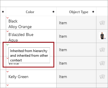
If a multi-attribute cell includes a mix of inheritance types, only one inheritance indicator arrow will display. This means that only one arrow will display even if both types are represented in the cell. The rules governing this are as follows: context inheritance (red arrow) will display over hierarchical inheritance (green arrow), and a reference that is inherited both from context and hierarchy (green arrow) will display over all other types of inheritance.
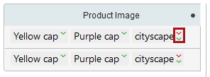
If a reference cell, either single- or multi-valued, contains references inherited from both context and hierarchy, the red and green arrows will both display in a stacked format, as shown in the screenshot below.
For additional information on using a Node List, refer to the following topics in Web User Interfaces documentation: