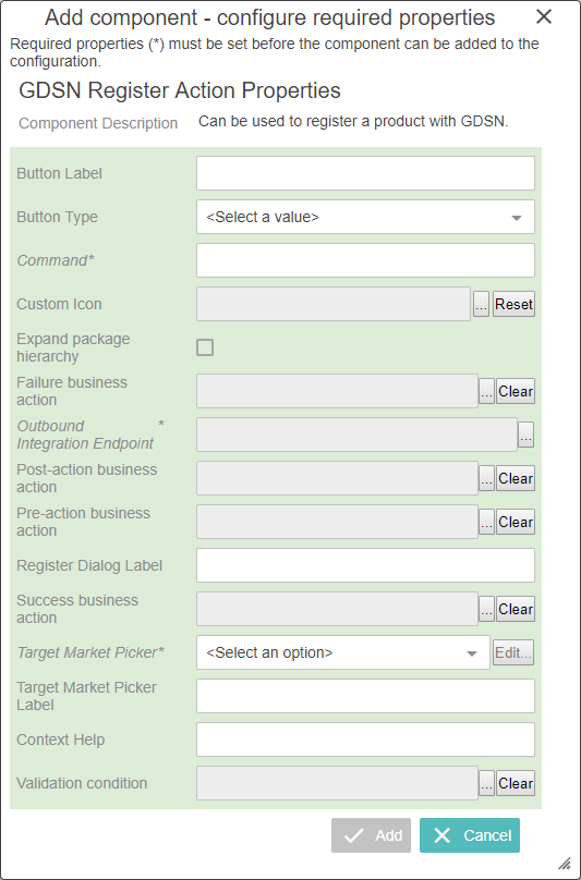
In the Designer, the Web UI component for the Register button is called 'GDSN Register Action.' Each parameter is described in the following table.
|
Parameter |
Description |
|---|---|
|
Button Label |
Optional Add a label for the Register button, displayed when the Button Type is Text or Both |
|
Button Type |
Optional Specify if the button should appear with an icon, text (the button label) or both. |
|
Command |
Mandatory Specify which GDSN command should be executed when a user clicks the Register button. In the default GDSN configuration, the command is 'register.' |
|
Custom Icon |
Optional Adding a custom icon will overwrite the default icon displayed in the graphical interface. The recommended size of the icons is 20 (height) x 35 (width) pixels. The recommended color of the icon in 'Jewel-toned' deep colors that fade well for the disabled state. *It should be noted that custom icons can only be used for actions configured as child components to a Node List screen |
|
Expand package hierarchy |
When checked, the registration also includes lower level objects in the packaging hierarchy. When unchecked, the registration will only include the selected product. |
|
Failure business action |
Optional Specify which business action to run if the Validation condition fails. |
|
Outbound Integration Endpoint |
Mandatory Specify the Outbound Integration Endpoint that should be used to send the command to the data pool. |
|
Post-action business action |
Optional Specify the Business Action that should run after clicking the Publish button. |
|
Pre-action business action |
Optional Specify the Business Action that runs first (before any other Business Rules) when clicking the Register button. This could be used to determine which GDSN command should be sent (Change_By_Refresh or Modify). |
|
Register Dialog Label |
Optional Apply the label of the Register dialog that appears when clicking the Register button. |
|
Success business action |
Optional Specify which business action to run if the Validation condition is successful. |
|
Target Market Picker |
Mandatory Configure the pop-up dialog that enables the end user to pick the target markets for the registration. |
|
Target Market Picker Label |
Mandatory Apply the label of the pop-up dialog used by end users to pick the target markets for the registration. |
|
Context Help |
Optional The name of the action will be displayed on mouse hover on the button when presented in the GUI. |
|
Validation condition |
Optional Specify which business condition should be validated before the product is processed further. Depending on the outcome of the validation, the 'Success business action' or the 'Failure business action' is called. If no condition is configured, no validation is executed and the Success / Failure business actions are not used. If a condition is configured, a Preflight option is presented in the Register dialog, enabling the user to run the Validation conditions and the Success / Failure business actions without actually registering to the GDSN. |
In the Child Components section, click the go to component link for the Buttons field.
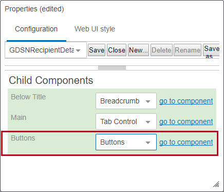
GDSN Register Action Properties screen will be displayed.
Note: The ‘GDSN Register Action’ button can be accessed through Node List screen as well.
Note: The following business rules (business action and business condition) must be available in STEP system to add in GDSN Register Action properties screen, if required: Failure business action, Post-action business action, Pre-action business action, Success business action, and Validation condition.
After configuring the required fields, click on ‘Save’ and close the designer.
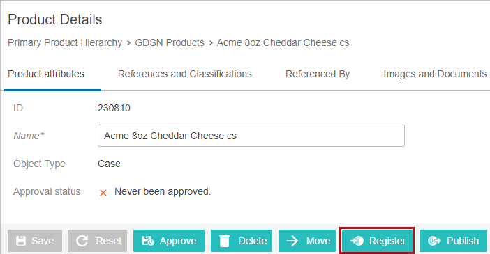
Navigate to the GDSN product to view the configured ‘Register Action’ button.
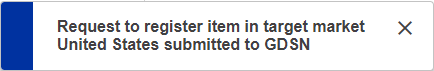
Clicking on the ‘Register’ button will display a pop up where the ‘Target Market’ needs to be selected.
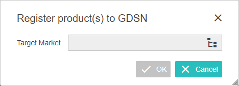
Select the required target market and click on the OK button. A confirmation message will display.
2019, Stibo Systems – Confidential