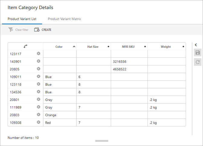
The List view is an overview of all variant products and the variant attribute values. This view also allows you to create and delete variants and modify variant values.
Note: Product variant attributes cannot be multivalued.
In the list view, one product variant ID is displayed on a row and the value for the variant attributes are shown in the columns.
The configured Product Variants List tab page is shown in the following image:
For a more advanced view including the ability to display the duplicates, use the matrix view as defined in the Product Variants Matrix in Web UI topic.
To view variant information in the workbench, refer to the Products Variants List in STEP Workbench topic or the Product Variants Matrix in STEP Workbench topic.
Prerequisite
Before using a product variant view, you must complete the steps in the Setting Up Product Variants topic.
Configure Product Variants List
Use the following steps to display a product variants list view.
- In Web UI, product variants can be displayed using the Variants List Tab Page. You can insert it into a Tab Control on a Node Details screen using the Child Components 'Main' parameter. For more information, refer to the Design Mode Basics topic and the Node Details Screen topic in the Web User Interfaces documentation.
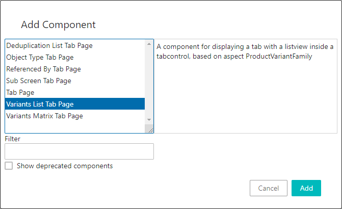
- Once added to the Node Details screen, double-click the Variant List Tab Page component to set the configuration parameters.
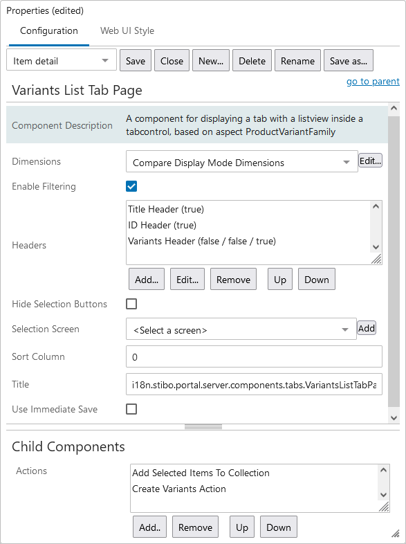
Dimensions
This option may change the standard sheet dimensions.
Enable Filtering
When the Enable Filtering option is selected on this component, the ability to filter based on attribute values is enabled.
To apply a filter, click anywhere in a column's header. This brings up the sorting and filtering window highlighted in the screenshot below:
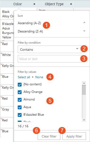
Referencing the numbered elements in the above screenshot to the corresponding numbers in the list below, functionality in the filtering window enables users to:
- Sort the attributes in either ascending (
 ) or descending (
  ) alphabetic order.
 - Filter the linked attributes by a condition to show only attributes that:
- 'Begins with' - The filter value begins with one or a sequence of character.
- 'Contains' - The filter value contains one or a specific sequence of characters. This value may appear anywhere within a value string.
- 'Does not contain' - The filter value does not contain one or a specific sequence of characters, whether in a single-valued or multi-valued cell. This value may appear anywhere within a value string.
- 'Equals' - The filter value matches a precise set of characters.
- 'Include Only' - This filter option allows users to set a list of values separated by a delimiter, like commas, semicolons, pipes, tabs, or newlines, and if one or more of the items in the list matches, then those rows will be populated. If no items from the list are present in the column, then no results will display.
- 'Wildcard' - This filter value option will display attribute values containing a repeated set of characters that includes known variable characters that can be substituted with an asterisk '*' symbol. Wildcard may be used singularly or multiple times in a filter setting. For more information, refer to the Wildcard in Searches section of the Advanced Search Functionality topic of the Getting Started documentation.
- With any of the above filtering criteria in place, users may enter their search terms into the Search field. As characters are typed into this field, the blue-checked values that display in the filtering menu change to reflect a filtered list of attribute values culled from the column's full list of values. From these, users may select only those attributes they want to display by adding a check beside each.
The default filter setting is 'Contains.' For the settings 'Begins with,' 'Equals,' and 'Wildcard,' if a user just deselects any value in the search list, then the filter will revert to a 'Contains' filter once it is applied. For the settings 'Begins with,' 'Contains,' 'Equals,' and 'Wildcard,' any values entered that do not meet the filter criteria are removed from the filtered selection. For the setting 'Does not contain,' any rows containing values that do meet the filter criteria are removed from the filtered selection.
Note: If you are dealing with multi-valued attributes where more than one value is populated, then All Values for that attribute are considered when creating a filter. Excluding one value by a filter does not mean the attribute will necessarily be removed from the view.
- Click the 'Select all' button to ensure all listed attribute values are checked. Click the 'None' button to deselect all attribute values. When users click 'None', the 'Apply filter' button is grayed out and cannot be selected until at least one of the attribute values is selected.
- Users may also forgo the filtering and manually select from the full attribute list only those attributes they want to display by adding a check beside each. All values are checked by default.
- Quickly clear any work you have done in the filtering window by clicking the 'Clear filter' button. The configuration you have applied remains in this filtering window, even if you clear the filter on the actual attribute link table. To clear all filtering, first clear the filter from the table, and then in the filtering window, click the 'Clear filter' button.
- Apply the configured filter to the attribute link table by clicking the 'Apply filter' button.
-
Once applied, the 'Clear all filters' button displays in blue. Click this button to remove any filters applied.
Note: When a Node List contains more than the configured number of objects (the default maximum being 5,000), sorting and filtering is disabled. This is because when Node Lists contain more than the configured maximum for display, all objects above that maximum will not display. Because sorting and filtering actions applied to the displayed objects will not also apply to non-displayed objects, sorting and filtering is disabled. For example, if an advanced search result contains 10,000 results, and the user clicks a header to sort and filter the Node List based on the values in the column, it will not be obvious that all objects after 5,000 are not included in the filtering, and so the resulting list will not be accurate. When users initiate sorting and filtering on a Node List with more than the configured maximum number of objects, an informational dialog displays that reads, 'Sorting and filtering on this subset of data would display inaccurate results, so they have been disabled.' This restriction is applied to all display modes that support sorting and filtering, i.e., Multi Edit, Table, and Compare views.
Filters applied in tables will persist for users (on the same computer) even after the user has:
-
switched the table view
-
switched context
-
navigated to a different product or page or tab
-
logged out of the Web UI
To turn off filtering, users can either click the 'Clear all filters' button or turn off the filter in each column to which filtering has been applied.
Headers
Use the 'Variant Header' option to display variant attributes on the table component.
Hide Selection Buttons
This option determines if the 'Select All' and 'Clear selections' options are displayed.
Selection Screen
This option determines the screen that will be displayed when one item is selected. If nothing is selected, the details panel will be hidden.
Sort Column
This field sets the starting column for sorting.
Title
This is the title of the configured component.
Use Immediate Save
If selected, then STEP will automatically save changes as soon as an edit is performed. Otherwise, the user will need to explicitly save their changes.
Actions
Add the 'Create Variants Action' button if desired. This child component allows for actions to be added for the user to interact with the data. For more information, refer to the Action Buttons topic in the Web User Interfaces documentation.
If added, configure the 'Create Variants Action'
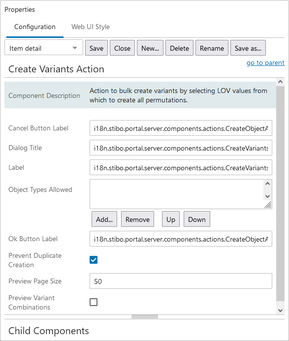
Prevent Duplicate Creation
When checked, clicking the 'Create Variants Action' button and selecting duplicate variant values displays an error and duplicates are not allowed.
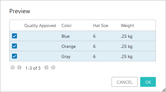
Preview Variant Combinations
When checked, clicking the 'Create Variants Action' button, selecting variant values, and clicking OK opens a Preview dialog with all new variants to be created. The user can click OK to create the items being previewed, or Cancel to return to the create variants dialog.
Note: As with any screen, the Node Details screen with Variants List Tab Page must be mapped appropriately in Main Properties > Mappings for end users to be able to access it.
Use the List View
- In the Tree, expand the Primary Product Hierarchy, and select the relevant product parent node that is configured for variants to display the list.
- Click the Variants List tab to view the following information:
- By default, product IDs are displayed in the first column and variant attributes and values are displayed to the right.
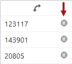
- If a Selection Screen is configured (in the Configure Product Variants List section above), click the details button to the right of an ID to show details for the selected product.
- Double-click into a cell to add a value for the variant attribute. LOV attributes show a dropdown and non-LOV attributes allow you to type directly into the cell.
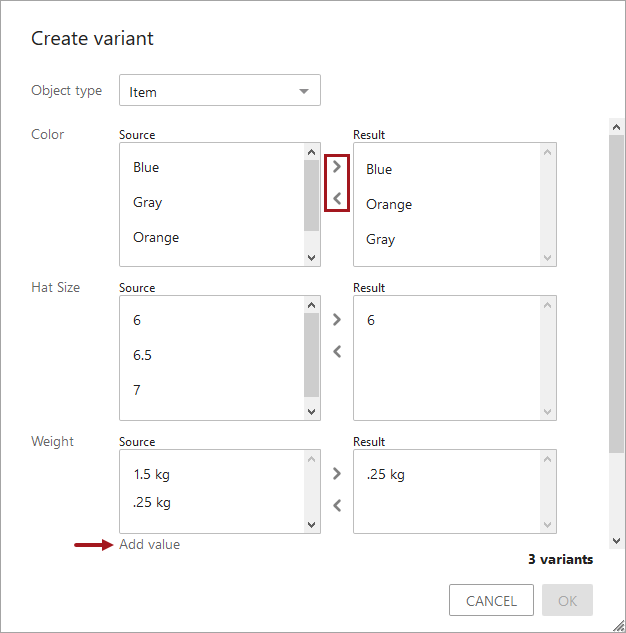
Create a Variant
If added as an Action during configuration, click the 'Create variants' button to display the 'Create variants' dialog. Variant attributes are displayed and values can be added for the selected object type. If the new values match an existing variant, the potential duplicates are shown above the Cancel button. In the following example, one other variant already exists with the selected 'Hat Size' and 'Color' combination selected.
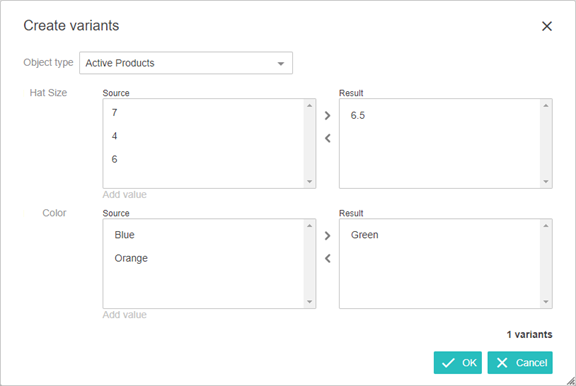
When creating a variant manually (rather than using an import file), note that only variant attributes values are added. Additional values can be added on a product editor screen.
- Verify an ID pattern for the variant object type is defined. This 'Create variants' button is disabled if no ID pattern is included. For more information, refer to the Autogenerate Using Name Pattern and ID Pattern topic.
- Select a cell within the table to activate the 'Create Variant' button (configured in the Configure Product Variants Matrix section above).
- Click the 'Create Variant' button to display the 'Create Variant' dialog. Variant attributes and the values are displayed and for the selected object type. Add the required data and click OK.
- If the parameter Preview Variants Combinations is configured (in the Configure Product Variants Matrix section above), the preview dialog shows the chosen combinations to be created. Click OK to proceed with the process or click Cancel to return to the create variant dialog.
Note: If the Prevent Duplicate Creation parameter is checked (configured in the Configure Product Variants Matrix section above), the combinations that match an existing variant are not created when the action is applied.