The Web UI Designer Graphical User Interface (GUI) is divided into four main areas plus a drag handle for window resizing:
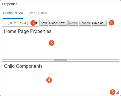
- Screen dropdown: Select which screen / component to review and edit.
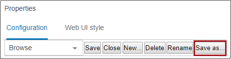
- Action icons: Icons that can be clicked allow users to save changes to the properties configuration, close / exit the properties window, create a new screen, rename a screen, or save a configuration as new screen ID. Each option is explained in greater detail in this documentation.
- Properties area: The main component properties of a selected screen are displayed and can be edited.
Parameters are grouped together on the component properties screens for easier understanding of parameter interactions. Parameters that are required, as well as those frequently used, are shown immediately when opening a properties page. Additional optional parameters are grouped by topic and displayed when the user clicks the arrowhead preceding the group.
- Child components area: This is the area where child components can be edited, deleted, and created. The area only displays information if the selected component can contain child components. If unavailable, the area under the Child Components header is empty.
- Resizable window: By dragging the lower right corner of the design window, users can adjust the screen to easily view all available content. The component fields within the window adjust in size to match the size of the window.
Creating a New Screen
Select a component from a list and give it an identifying screen ID. The screen ID will show in the dropdown once saved.
- Click the New... button in the Designer.
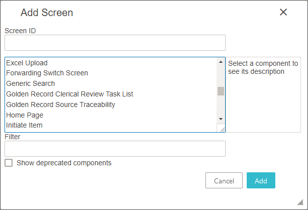
- In the 'Add screen' dialog, enter an ID for the new screen in the Screen ID field. Make it descriptive so that it can be easily identifiable when a user looks through Screen IDs to make a selection.
- In the screen type list, select the screen type you want to create by clicking on the displayed screen ID. Click the ID to view explanations on the different types. Use the Filter field to quickly display only the components matching the text entered in the filter box.
- Click the Add button.
The new screen is created and displayed in the Web UI. You can now configure any applicable parameters and child components within the properties dialog.
Note: When the 'Show deprecated components' checkbox is checked, the withdrawn or deleted components will be listed within the screen type list. Using any of these deprecated components will prompt the Web UI user with an error.
Deleting a Screen
Delete an existing screen ID, and the ID will be removed from the screen dropdown list.
- Select the screen you want to delete from the dropdown screen list.
- Click the Delete button in the clickable icon row of the Designer window.
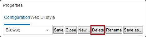
- A 'Delete screen?' dialog appears. Click OK to proceed.
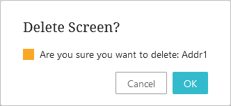
The screen is now deleted.
Note: If a screen is referenced by other parts of the configuration a warning will appear telling where the screen is referenced. The screen cannot be deleted until the references are deleted. The delete button is inactive when you are on the ---[LOGIN]---, ---[MAIN]---, or ---[HOMEPAGE]--- screen IDs.
Renaming a Screen
Rename an existing screen ID to a new screen ID, and the existing screen ID will be replaced by the new one.
- Select the screen you want to rename from the screen list.
- Click the Rename button in the Designer.
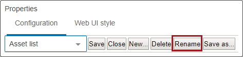
- A 'Rename screen' dialog appears. Enter the new name for the screen ID.
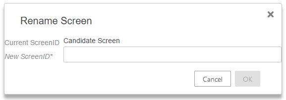
- Click OK.
The screen is now renamed. If the renamed screen is referenced somewhere else in the Web UI configuration, the old name (screen ID) will automatically be replaced by the new name.
Note: The that the 'Rename' button is inactive when you are on the ---[LOGIN]---, ---[MAIN]---, or ---[HOMEPAGE]--- screen.
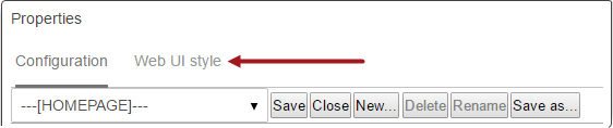
Changing the Web UI Style
The settings on the Web UI style tab can be changed any time designer is open. The Web UI style is applicable to the entire Web UI and not just for the screen and/or component being configured. To access the style configuration parameters, click 'Web UI style' found at the top of the designer panel, as seen in the screenshot below.
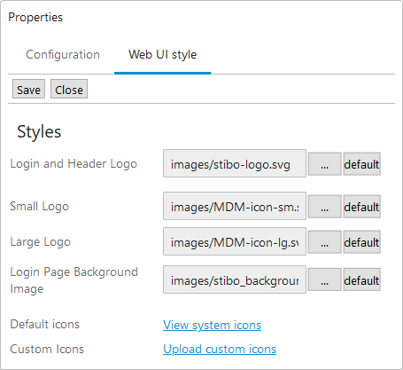
When in the Web UI style tab, the list of available parameters will display:
While on the Web UI style tab, click the ellipsis button ( ) to bring up the settings dialog for any of the listed parameters. Click the 'default' button to return any of the customized selections back to the default values. For 'Accent and 'Navigation', the click the ellipsis button () brings up a color picker. For 'Accent' and 'Navigation,' click the button with the palette icon (
 ) to open a 'Color Tester' dialogue from which users can select new colors for specific Web UI elements.
Below are listed the available parameters and how to configure them.
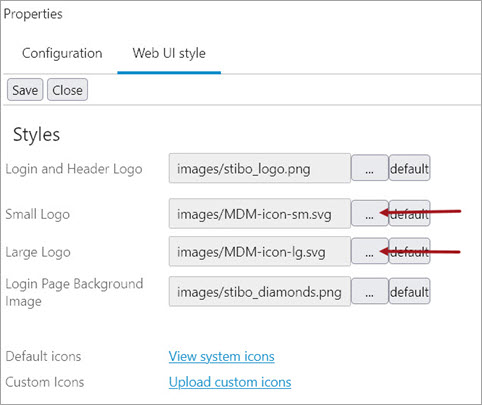
Login and Header Logo - Select the image that will display at the top of the login window on the Web UI login page. If the Stack Panel is configured rather than the Global Navigation Panel, the image selected will also display in the Global Header, which does not display when the Global Navigation Panel is configured. A height maximum of 40 pixels is recommended.
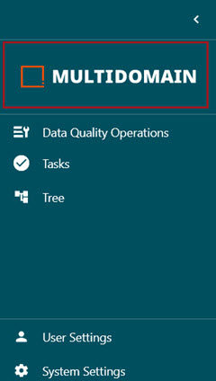
Small Logo - Select the image that will display at the top of the configured Menu Items in the Global Navigation Panel when the Panel is in its default, collapsed form. A maximum resolution of 240 x 184 pixels is recommended.
Large Logo - Select the image that will display at the top of the configured Menu Items in the Global Navigation Panel when the Panel is in its expanded form. It may be useful to use the same image as in the 'Small Logo', as when the column expands and retracts, the logo image switches between the 'Small Logo' and the 'Large Logo.' If the same image is used for both, the effect is a smooth enlargement / reduction animation. A maximum resolution of 184 x 32 pixels is recommended.
Login Page Background Image - Select the image that will display in the background on the login page. A minimum resolution of 1920 x 1200 pixels is required, and the file format can be png or jpg.
Default Icons - When 'View system icons' is clicked, a window displays showing all available system icons. This is a reference feature; no icons can be selected.
Custom Icons - Click 'Upload custom icons' to bring up a dialog that enables users to upload image files from their machine and bring them into the system. Images loaded will not display in the 'Default icons' window, but will be available when selecting to customize an icon throughout the Web UI.
Important: Logo files can be svg, png, or jpg formats unless shown differently above. Pixel recommendations are shown per logo. Use caution uploading Web UI style image files with a super high resolution, since this may cause Web UI pages to load slowly.
Using custom icons
In order for the icon to appear consistently in all Web UIs within a clustered environment, users must first add the files to the server either manually or via the 'Custom Icons' process described in the previous section. The default path to the file system location where custom images are located is webui/custom-theme/icons.
To change the default file location, add the case sensitive property WebUI.Theme.Images to the sharedconfig.properties file on the STEP application server. The property needs to point to an existing directory in which the server should pull the stored logos. For example:
-
Small logo example:
WebUI.Theme.Images=webui/custom-theme/images/Small-Logo
-
Large logo example:
WebUI.Theme.Images=webui/custom-theme/images/Large-Logo
Once the path is in sharedconfig.properties, open Web UI Design Mode and navigate to Web UI style tab. From there, you can browse for the desired icon by pressing the  button. Choose the logo from the 'Select Existing' tab and click OK.
Saving Changes to a Configuration
There are two options for saving screens in the designer.
Save: After making configuration edits, click the Save button. The screen is saved with the current screen ID.
Save as: Saving a screen configuration under a new screen ID:
- Click the Save as button in the Designer.
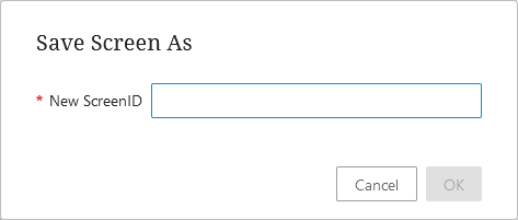
- When the 'Save screen as' dialog appears, enter an ID for the new screen. Make it descriptive so that it can be easily identifiable when a user looks through Screen IDs to make a selection.
- Click on OK when finished.
Both the new screen ID and the original screen ID show in the screen dropdown list.
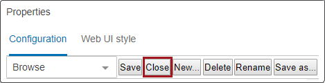
Exiting Design Mode
Exit design mode by clicking the Close button.
If you have unsaved configuration changes, you will receive an 'Unsaved changes' warning.
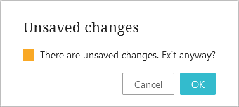
- Click OK to close the designer without saving changes.
- Or, click Cancel to be sent back to the properties screen so that you can Save the current screen or Save as a new screen ID.
After closing / exiting the designer, the Web UI is now in normal mode.