The Node Picker Dialog parameter is available on some components in Web UI. It allows the admin to define the nodes that are presented for selection in the dialog and also allows the admin to determine how the nodes are selectable.
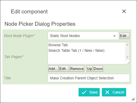
Root Node Plugin
Allows the designer to limit the nodes presented to the end user.
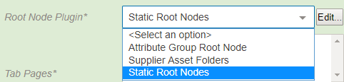
- Attribute Group Root Node displays a parameter to select any number of attribute groups. These will be the only attribute groups displayed to the end user.
- Supplier Asset Folders displays only the asset folders for suppliers that the user is a member of.
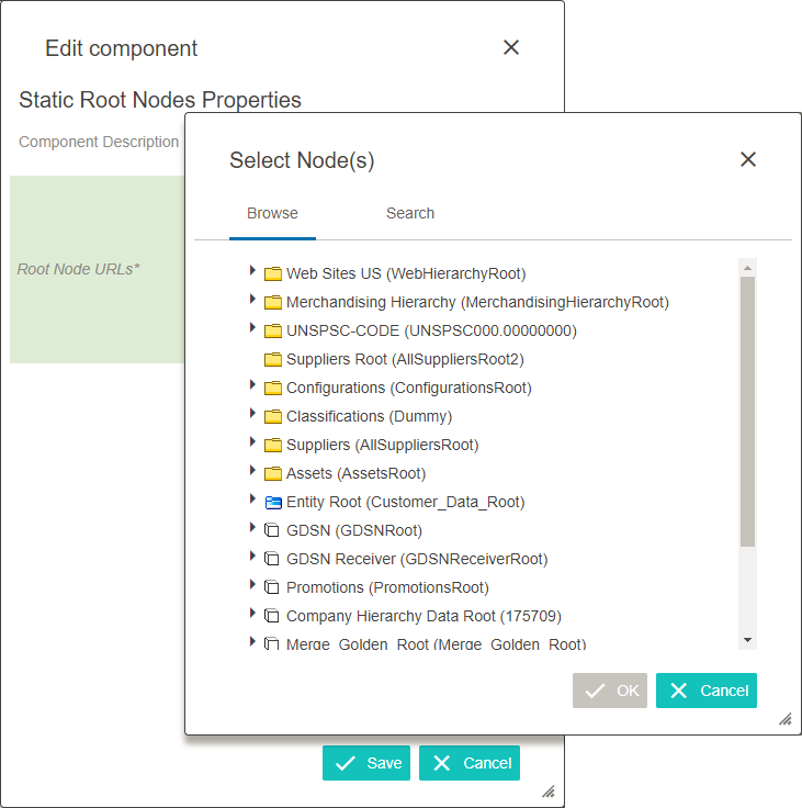
- Static Root Nodes allows selection of any number of nodes in Tree to be displayed to the end user. This allows the admin to restrict the nodes displayed to the end user and can be used to eliminate invalid selections.
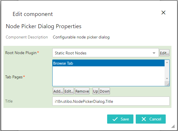
Tab Pages
Allows the designer to choose the tabs displayed on the node picker dialog presented to the end user.
- Browse Tab allows the Tree to be displayed for node selection. Only the nodes configured via the Root Node Plugin display.
In the Tab Pages parameter, click Add and select 'Browse Tab' from the list. Then click Add.
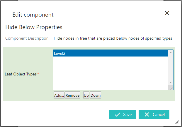
If desired, children of nodes can be hidden from the tree when displayed.
- To do so, double click on Browse Tab.
- In the Browse Tab Properties window that appears, select 'Hide Below' from the dropdown.
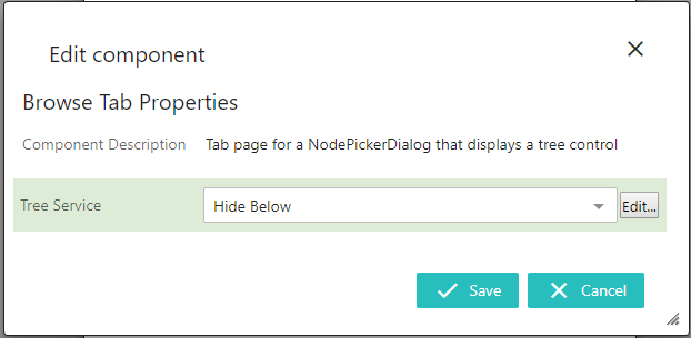
- Click Edit and in the Hide Below Properties window that appears, click Add and select the object types which should not have their children displayed in the browse tree.
- Nodes of Object Type Tab displays all instances of object types found among the configured root nodes.
In the Tab Pages parameter, click Add and select 'Nodes of Object Type Tab' from the list. Then click Add.
A number of optional parameters are available to assist in parsing the node list.

- Headers: This parameter is used to organize the node list with configurable headers. To add a header, click Add and select a header component.
- Max List Size:This parameter dictates the maximum nodes that can appear in the list. This list can never exceed '1000'.
- Tab Page Width: This parameter sets a fixed width in pixels on the tab page.
- Valid Object Types: This parameter can be used to specify which object types can populate the list. To add a valid object type, click Add and browse or search for the desired object type.
- Search Table Tab allows objects to be found via search, and includes options such as configurable wildcards, headers, and typeahead. The Select Node(s) Search functionality returns a maximum of 100 entries.
In the Tab Pages parameter, click Add and select 'Search Table Tab' from the list. Then click Add.
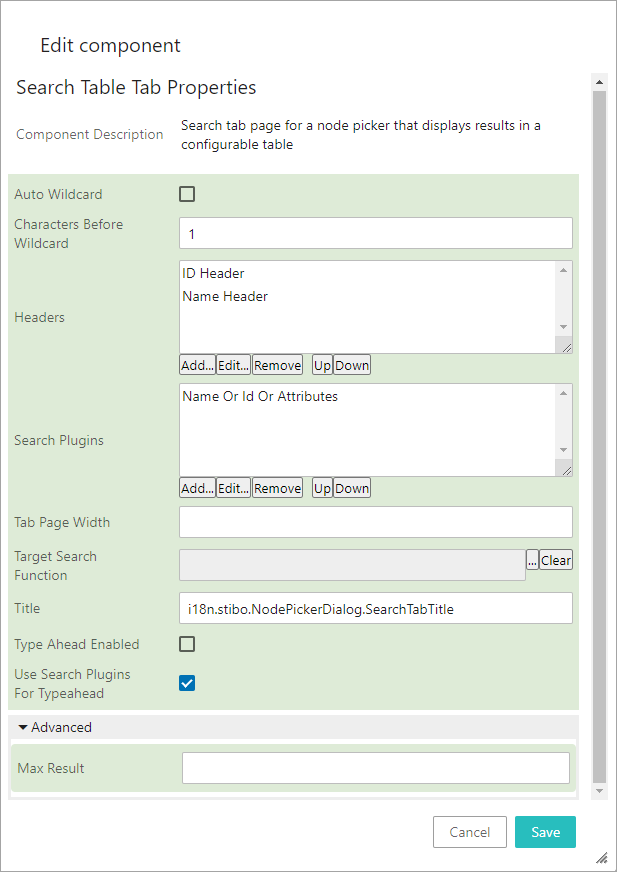
A number of optional parameters are available.
- Auto Wildcard: If this parameter is enabled, a wildcard is automatically added to the end of any search strings longer the amount specified by the Characters Before Wildcard parameter.
- Characters Before Wildcard: Use this parameter to set the minimum number of characters that must come before a wildcard. Setting this to '0' allows you to include a wildcard at the beginning of the search string.
- Headers: This parameter is used to organize the search result list with configurable headers. To add a header, click Add and select a header component.
- Search Plugins: This parameter determines which search plugin is used to execute the search. Click Add to select the desired search plugin.
Of the available selections, the Name Or Id Or Attributes option allows the text entered in the search field to be compared to the ID, name, or value of one or more attributes selected by the admin. The ability to search in data containers is also controlled on this parameter. For example, this option would allow searching on attribute values, including metadata values.
- Tab Page Width: This parameter sets a fixed width in pixels on the tab page.
- Target Search Function: Use a Business Function to search for a reference target. When this is set, the parameters 'Search Plugins' and 'Use Search Plugins For Typeahead' will be ignored. To read more about this functionality, see the Custom Reference Target Search topic here.
- Title: This parameter determines the title of the individual search tab.
- Type Ahead Enabled: If this parameter is enabled, typeahead can be used in the search field.
- Use Search Plugin For Typeahead: This parameter can be disabled to improve search execution speed. More specifically, disabling it allows the usage of a prefix search via typeahead, which ignores root nodes set on the Below Search plugins, but increases the performance of typeahead searches. This parameter is enabled by default.
- Advanced > Max Result: If set, the typeahead search will show a limited result set. If Target Search Function is configured, this setting might be used to raise the number of search results from default 100 to max. 1000.
Each tab page needs configuration upon selecting it. If any parameters within the tab page are mandatory, then the properties dialog will open automatically upon adding.
Note: If configured on a Search tab in a Node Picker in Web UI, a Below Search component will be disabled if the Primary Product Hierarchy is configured as the root node since this functions the same as if there were now Below Search criterion. This limitation, existing only in Web UI, is due to performance issues from the large amount of returned search results. Also, if the Below Search component is configured on the component, then an attribute search would be performed before the Below Search operation.
Title
Allows the designer to use custom text as the title of the node picker dialog.
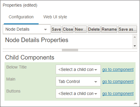
Configuration of Node Picker for References in Node Details
The example below shows a configuration of Node Picker for References in a Node Details screen:
- Select Node Details screen if already exist, if not create a new one.
- Under the Child Component area go to > Main > Tab Control > choose go to component.
- On Tab Control Properties, go to Child Components > Tab Pages field > add a new Tab Page by clicking on Add button.
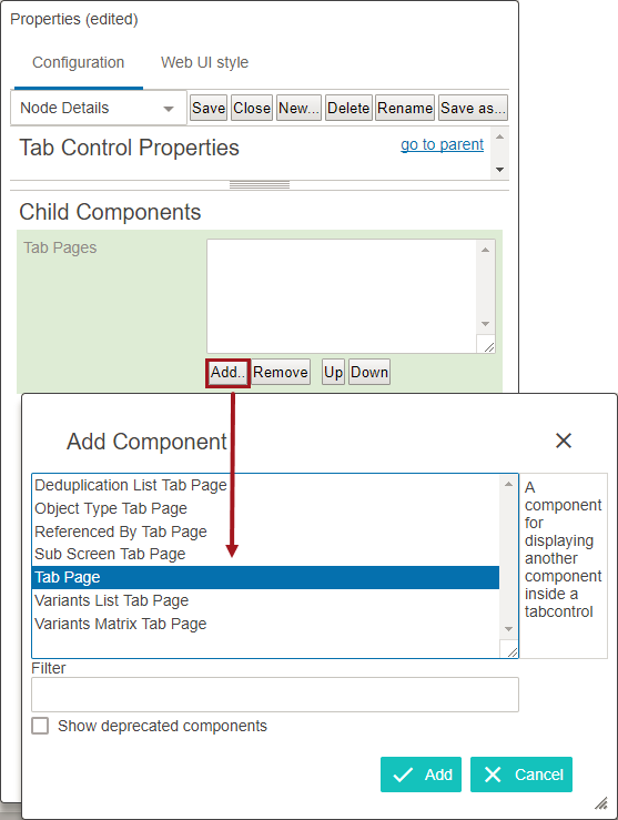
- Once added, double click on the Tab Page.
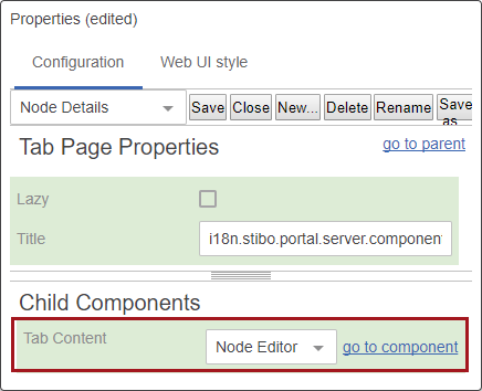
- From the Tab Content dropdown, select the Node Editor and then click on go to component.
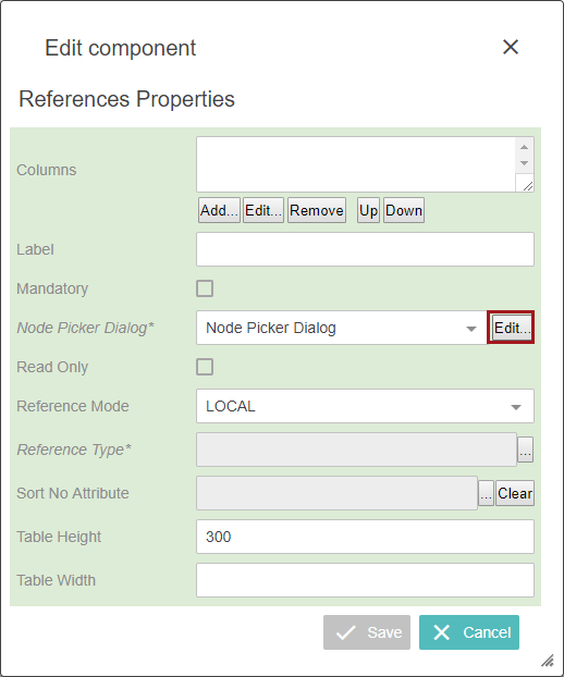
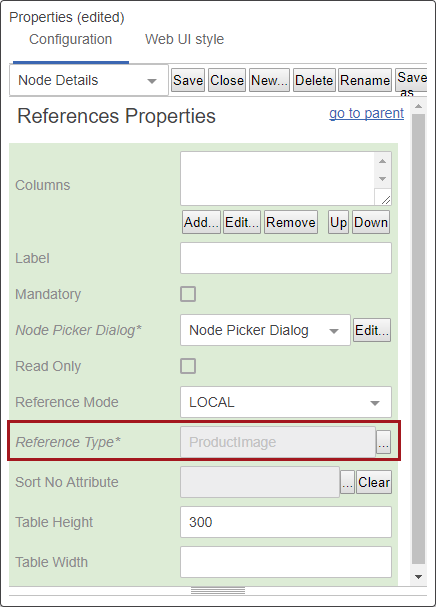
- On the Tab Page Properties go to Child Components > Rows > add References.
- In the Reference Properties screen, on the Node Picker Dialog field, select the Edit button.
- On Node Picker Dialog Properties under the Root Node Plugin field, select Static Root Node from the dropdown.
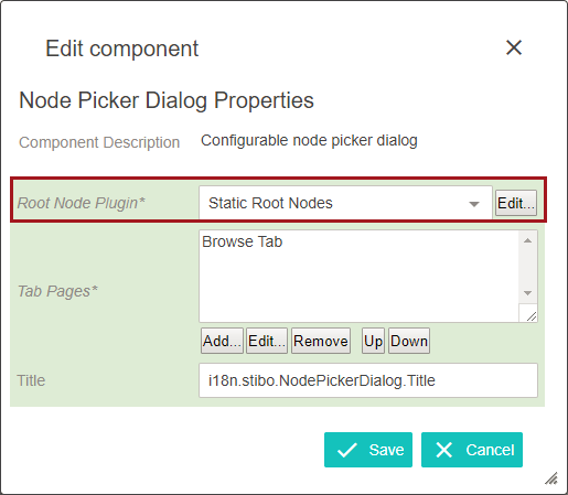
- Click on the Edit button to configure Static Root Node properties.
- Add any required root nodes, click OK, and then click the Save button in on Static Root Node Properties.
- Back on the Node Picker Dialog Properties go to the Tab Pages field and click Add.
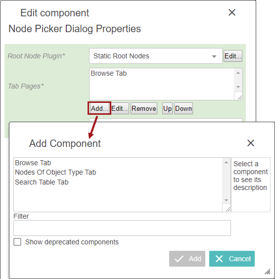
- Select, add, and configure any required components needed.
- In the Title Field and a title for the Node Picker.
- Click save on the Node Picker Dialog Properties and continue filing out the necessary fields on the References Properties, including selecting the Reference Type. Click save when finished.
- Then save and close the Node Details screen.
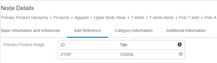
In the example below, the reference type 'Primary Product Image' is available with the node picker (+) option.
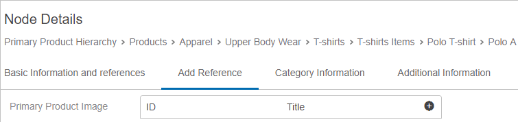
To use this, a user can:
- Stand on any available product
- Select the Add Reference tab
- Click on the (+) icon
- Select the required image by expanding the node or by searching. Upon clicking OK, their reference is added to the selected product.