Summary
Enhancements and changes to the Web UI for the 9.3 release include:
- Custom Export Action gives users a simpler way to export table views in the Web UI. Supports one-click export as well as more configured exports.
- To better inform users as to which actions are configured and available, selection-dependent toolbar actions now display in the toolbar regardless of whether a selection has been made. Additionally, toolbar actions can now be grouped using the 'Menu Group' component.
- Errors generated in the Web UI by running business rule-related components or importing Smartsheets are now more easily accessible.
- Multi-value attributes can now have their values ordered and reordered in the Web UI via a new, easy-to-use interface.
- With the configuration of business actions using new JavaScript binds, it is possible to automatically publish objects to PDS only when they meet the configured Sufficiency Metrics, ensuring data adheres to established quality standards.
- The Search Screen Actions menu allows users to manually execute user-defined business actions on the results of a search, providing the ability to modify the objects directly from the Search Screen.
- Static facets available on the Search Screen can be added or removed directly from the Web UI, enabling users to modify the visible filter groups as needed.
- New highlighting of applied static facets is displayed on the Search Screen and allows users to easily identify how the results are filtered. Applied static facet values are moved to the top of the available values selections list so users can easily modify selected values.
- New sorting options for the Search Screen allow users to prioritize search results more efficiently and include 'Last updated date,' 'Date of creation,' 'Relevance,' and 'Attribute.'
- The basket functionality no longer requires the activation of the ‘data-sufficiency’ component.
- Enhanced marketing information can be displayed on the Product Editor screen and allows users to see content available via Syndigo in Web UI.
- The Move Action and Initiate Business Action are superseded in favor of a more robust alternative.
- When applying dimension dependencies to attributes and List of Value objects, users can select specific dimension points to which data can be applied.
- Data Containers displayed using the Data Container Table View Editor now support custom configuration of row height and column width.
- The Advanced Search screen now provides a date picker component when searching for attributes that require date selection.
- Input fields are now dynamically sized to improve Web UI layout.
- The 'Target or Reference Metadata Value Header' now supports the ability to display and edit metadata on Product to Classification Links in Web UI tables.
- The number of errors that can display in a background process's Execution report is now configurable.
- Image thumbnails are now enabled for display on classification and entity objects on Node List screens in the Web UI.
- The KPI Widget has been updated to ensure the pie chart fills more of the available space.
- A new filtering option for Web UI tables allows users to search multiple delimiter-separated values to filter for precise matches.
- A new header called 'Duration in Workflow State Header' displays how long an object has spent in the current workflow state.
- Focus on a selected node in the Tree Navigator will now persist without shifting to a different instances elsewhere in the hierarchy.
- Business Action with Web UI Bind component can now be configured to restrict the number of nodes upon which its business action can be run.
- Some Web UI functionality supporting data validation has been removed or superseded as more current components meet the requirement more efficiently.
- The Golden Record Linked Members Component has three new components that enhance its usability.
Details
Improved export capabilities in Web UI
Export capabilities for tables in the Web UI have been updated for improved usability. One of the key areas of focus for this functionality is to improve the user's ability to export the contents of a table without having to build a time-intensive mapping to create the export.
The key updates include:
- The 'Simple Exporter Action' toolbar action has been renamed to 'Custom Export Action.' Configurations of the 'Simple Exporter Action' will persist following an update to 9.3, but the expanded functionality included in this update will also be available.
- 'Custom Export Action' supports both a single-click export of Web UI table data, as well as more complex configurations using the 'Custom Export' configuration window. All exportable headers displaying in the table, whether through configuration of the table or through configuration on an applied user configurable view, now display in the 'Custom Export' configuration window by default. Users can add or remove these headers to create the desired export. Previously, all headers required for export had to be manually added even if they were already displaying in the table.
- Users who create custom-designed exports in the 'Custom Export' configuration window can now save and reuse those exports. By checking the box in the 'Custom Export' configuration screen called 'Save export as template,' the export configuration is saved locally and can be used for future exports. If shared, the export configurations can be reused by all members of the designated user groups. Additionally, users can elect to click the 'Export Current View' button in the export configuration selection window; rather than select a pre-existing configuration or build a new one, 'Export Current View' exports the table columns as they currently display.
- A new parameter allows designers to restrict whether the end-user can execute an export with a single-click, or if the 'Custom Export' configuration window can be accessed to allow the end-user to create exports that differ from the data displaying in the table. This enables the admin user to more tightly control how the end-users export Web UI data.
- Data displaying under the Target or Reference Metadata Header can now be exported from a Web UI table using the updated 'Custom Export Action' toolbar action.
It is important to note that some data types that can be configured to display in Web UI tables, like assignee, reference metadata for reference types that allow multiple references, approval status, etc., are not supported for export, even with this update.
For more information on the updated Custom Export Action, see the Custom Export Action topic in the Web User Interfaces / Web UI Getting Started documentation here.
Toolbar action updates
Two improvements have been made to how toolbar actions can be accessed in the Web UI:
- All toolbar actions added to Node Lists will now display in the toolbar regardless of whether a selection has been made. Previously, selection-dependent toolbar actions would not display in the toolbar unless a user selected one or more objects. This had the effect of requiring users to make a selection to see the full range of available toolbar actions configured on a Node List. Now, selection-dependent toolbar actions will display without a selection having been made but will show as inactive (grayed out) pending a selection. This ensures that users can see at a glance which actions are available. Selection-neutral toolbar actions will continue to display as active.
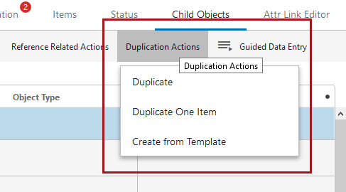
- In light of the change described above to display all toolbar actions by default, designers now have the option to further streamline their Web UI by slotting individual toolbar actions into button groups. This gives admin users the ability to better control Web UI display, and ensure the most frequently used actions are most accessible. Through configuration of a new toolbar action called 'Menu Group,' users can add multiple toolbar actions into a group. When the group button is clicked, a dropdown displays showing all configured actions. In the screenshot below, the toolbar group is called 'Duplication Actions', and the three toolbar actions that display in the dropdown have been added to the 'Duplication Actions' button group. Toolbar actions that can be selected will display in black text; those that are inactive and cannot be selected will show in gray text.
Users with Node Lists that have a large number of toolbar actions configured will see all configured toolbar actions display following an upgrade to 9.3. Some may wish to make configuration changes on Node Lists to accommodate the update. To aid backwards compatibility, users may continue to hide selection-dependent toolbar actions by adding the WebUI.ShowWebUIToolbarActionsWithoutSelection property to the sharedconfig.properties file and setting it to 'false.'
For more information on toolbar action buttons, see the Action Buttons topic in the Web User Interfaces / Web UI Getting Started documentation here.
Actionable error handling for business rules and Smartsheets
The presentation of errors and warnings generated by the Business Action with Web UI Bind component and Smartsheet imports has been updated to improve accessibility and better empower users to take immediate corrective action. All updates described are applicable to attribute errors only.
These are the updates to error handling functionality for the 9.3 release:
- Error and warning messages generated from running business rules on Node Details screens now display under the relevant field. Additionally, multiple error messages can display beneath a field.

Previously, errors generated from business rules executed via business rule-enabled Web UI component buttons (including the Business Action with Web UI Bind, Submit, Bulk Update, Approve, Initiate Business Action Action, and Initiate Business Condition Action) would display as a popup and in the Warning Notification Panel.
- A new bind called 'Data Issues Report' enables users to configure business rules for use in the Web UI that will include error or warning messages.
- Error and warning messages that display in the Warning Notification Panel through usage of the 'Date Issues Report' bind include active links to the relevant object. These links enable users to navigate directly to the object in question to take quick action.
- Error and warning messages configured via the 'Data Issues Report' bind are automatically filtered to show only those that are current and relevant. For instance, if a business rule is run that determines whether an attribute value is invalid, and the user corrects the attribute value to make the value valid, any error messages generated from running the business rule disappear from beneath the field. When the corrected attribute value is saved, the error and warning messages are automatically removed from the Warning Notification Panel. With this release, the system applies automatic validation to ensure not only that displayed messages pertain only to active errors or warnings, but that no duplicate messages are presented to the user.
- Smartsheet import errors now display on the Warning Notification Panel in the Web UI. Each error is accompanied, when applicable, by a link that will navigate the user directly to the affected product. Previously, the errors could only be found in the execution report section of the background process, which involved time-intensive manual navigation. Now, the error can be easily found, understood, and acted on, all in the Warning Notification Panel, which can be accessed with a single click.
- If an erroring object is imported into the system via a Smartsheet import and resides in a workflow, the link to that object will navigate the user to the Task List screen assigned to the workflow state in which that object exists. This allows users to quickly see where in a workflow an object sits and quickly take corrective action to progress that object through the workflow.
For more information on the Business Action with Web UI Bind component, see the Business Action with Web UI Bind component topics in the Web User Interfaces / Web UI Getting Started documentation here. For more information on the 'Data Issues Report' bind, see the JavaScript Binds topic in the Resource Materials documentation here. For more information on importing Smartsheets in the Web UI, see the Smartsheets in Web UI topics in the Web User Interfaces / Web UI Getting Started documentation here.
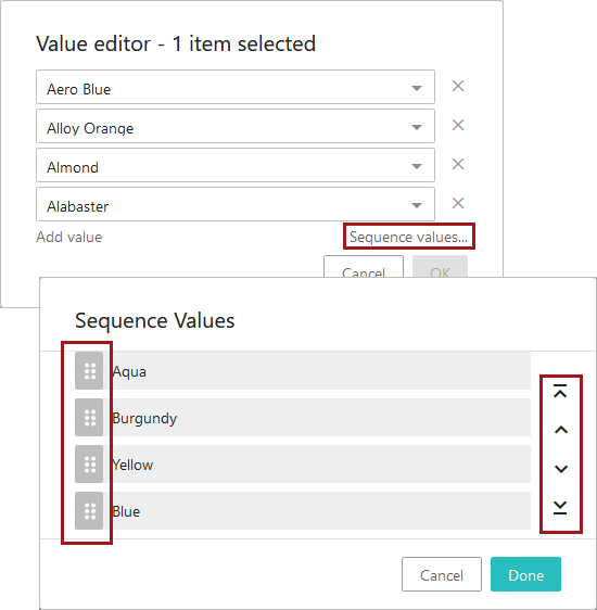
Sequencing multi-valued attributes in Web UI
Multi-valued attribute values can now be sequenced (or resequenced) in the Web UI when displayed in a Node Editor or in a Node List.
When displaying in a Node Editor, a sequencing icon will display (  ) to the right of the field. When the icon is clicked, a 'Sequence Values In' window will show in which users can either click and drag values with the drag handles to the left of each value or use the arrow icon buttons to the right of each value. These buttons can move the selected value to the top of the list (
  ), up one position (
  ), down one position (
  ), or to the bottom of the list (
  ).
).
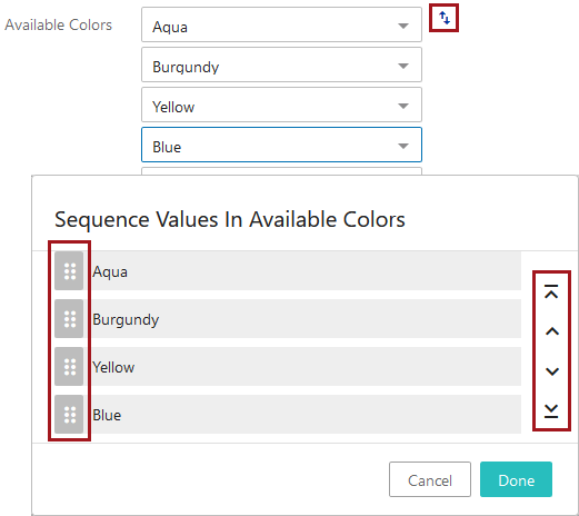
When multi-valued attribute values display in a Node List, users can click the 'Sequence values...' link to display the 'Sequence Values' window. Again, users can either click and drag values to move them, or use the arrows.
Automatic publishing to PDS now possible on sufficiency metrics
Configuring sufficiencies and metrics define rules and conditions that evaluate the quality and completeness of data on a given object. Now, an administrator can configure automatic publishing to PDX based on sufficiency metrics using the following two new JavaScript business action binds:
- Sufficiency Check Action Context - captures nodes, recipient mails, and channel ID data from the PDX Export Wizard for use in a business action.
- PDX Submission Context - allows submission of objects to a PDX channel directly from a business action including nodes, recipient mails, and channel ID data.
For more information, see the Publishing Only Sufficient Products to PDX topic in the Web User Interfaces / Web UI Getting Started documentation here.
To use this functionality, install the following add-on components: 'data-sufficiency', 'productdatasyndication-integration', and 'ui-basket'. Instructions for installing components can be found in the SPOT Program topic in the System Administration documentation here.
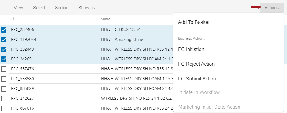
Execute business actions from the Search Screen
The Search Screen allows users to easily filter objects in a user-friendly way, and business rules can be configured to validate objects, send objects to a workflow, or any number of other actions. Now, both functions can be performed directly from the Web UI Search screen. User-defined business actions that are valid for all selected search result objects are available via the Actions menu. The selected business action is executed via a background process against the selected objects in the current Search results. This new functionality gives users the ability to search, select, and take action on objects all from a single screen.
For more information, see the Search Screen Actions topic in the Web User Interfaces / Web UI Getting Started documentation here.
Before starting Search Screen configuration, contact your Stibo Systems account manager or partner manager for assistance. Activation and configuration of Elasticsearch and the Search Screen (via the 'X.Elasticsearch' license and the 'elasticsearch-integration' add-on component) should not be done without the assistance of Stibo Systems.
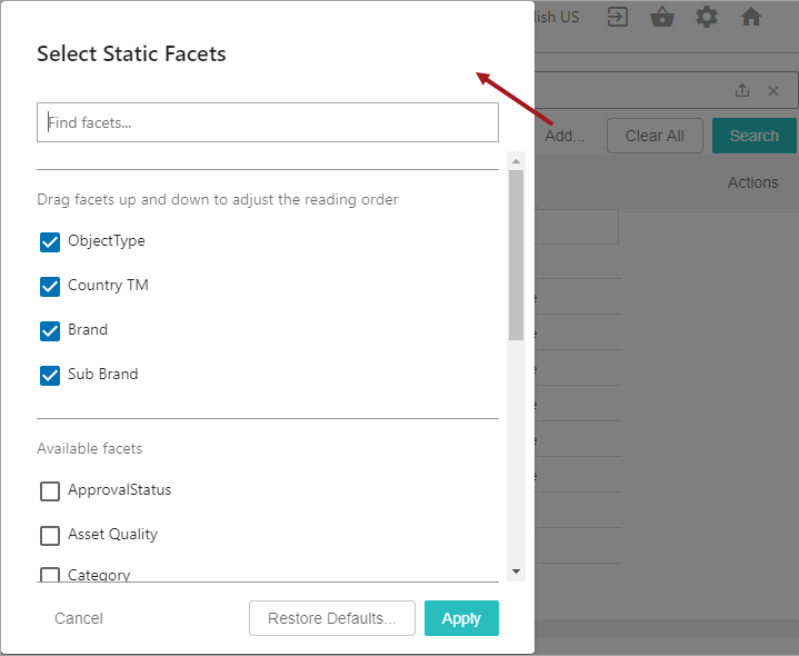
Modify static facets displayed on Search screen
On the Search screen, users filter search results with static facets to refine the results displayed. The new static facet 'Add...' button allows a user to effortlessly change the displayed static facets, providing a personalized group of filter options. A single list of attributes is configured by an administrator and is used to define the attributes on both the static facets and Search screen views.
For more information, see the Search Screen Static Facets topic in the Web User Interfaces / Web UI Getting Started documentation here.
Before starting Search Screen configuration, contact your Stibo Systems account manager or partner manager for assistance. Activation and configuration of Elasticsearch and the Search Screen (via the 'X.Elasticsearch' license and the 'elasticsearch-integration' add-on component) should not be done without the assistance of Stibo Systems.
Improved visual cues for applied static facets on Search screen
Static facets on the Search screen now allow users to easily visually see any limits set for search results. Once a static facet is applied, the facet now displays with a blue background and shows either a single value selection (as shown below for the 'Item' value selected in the Object Type facet) or shows the facet name for multiple selections and the number of values selected (as shown below for the Brand facet, where two values are selected). Previously, only the text updates were displayed when a static facet was set, which made it difficult to distinguish the filters that were applied to the search results.
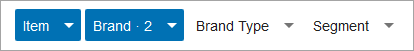
Additionally, any values selected and applied for a static facet are moved to the top of the facet values list. This priority listing allows users to easily see the selected values which is helpful when the list includes a large number of values.

For more information, see the Search Screen Static Facets topic in the Web User Interfaces / Web UI Getting Started documentation here.
Before starting Search Screen configuration, contact your Stibo Systems account manager or partner manager for assistance. Activation and configuration of Elasticsearch and the Search Screen (via the 'X.Elasticsearch' license and the 'elasticsearch-integration' add-on component) should not be done without the assistance of Stibo Systems.
New Search screen sort options
Users can now prioritize search results more efficiently using the following new sort options:
- Attribute - attribute values, alphabetically by default.
- Date of Creation - the date of the first STEP revision, with the newest date at the top by default.
- Last Updated - the date of the object's last revision, with the newest date at the top by default.
- Relevance - objects that best match the configured search word(s). This always returns the best-matched results at the top.
While only one sort option can be applied at a time, the sorted results can be displayed in ascending or descending order, except for Relevance, which is always displayed with the best-matched results at the top. Additionally, the selected sort order is included in the status bar displayed at the bottom of the Search screen.

For more information, see the Search Screen Sorting topic in the Web User Interfaces / Web UI Getting Started documentation here.
Before starting Search Screen configuration, contact your Stibo Systems account manager or partner manager for assistance. Activation and configuration of Elasticsearch and the Search Screen (via the 'X.Elasticsearch' license and the 'elasticsearch-integration' add-on component) should not be done without the assistance of Stibo Systems.
Basket component is no longer dependent on Sufficiency component
Previously, the Search screen's Basket functionality required the activation of both the 'ui-basket' component and the ‘data-sufficiency’ component. Now, the basket add-on component can be installed independently.
For more information, see the Search Screen Basket topic in the Web User Interfaces / Web UI Getting Started documentation here.
Instructions for installing components can be found in the SPOT Program topic in the System Administration documentation here.
Enhanced marketing information on Product Editor screen
Rich marketing content is often requested from a third-party source such as Syndigo. An administrator can now configure this content to display in the Product Editor screen along with the product details. One-time configuration in workbench System Setup enables integration with Syndigo, which allows enhanced marketing content to be displayed in Web UI. Data stewards can use this Web UI preview to verify how the marketing information will be presented to customers.

For more information, see the Adding Rich Marketing Content from Syndigo topic in the Web User Interfaces / Web UI Getting Started documentation here.
To use the Syndigo integration on the Product Editor screen, the 'ui-product-editor' and the 'syndigo' add-on components must be installed. Instructions for installing components can be found in the SPOT Program topic in the System Administration documentation here.
Move Action and Initiate Business Action are superseded
The status of actions 'Move Action' and 'Initiate Business Action' have been set to 'Superseded,' and it is recommended that users configure the 'Business Action with Web UI Bind' component in their place. This status change has been made because the 'Business Action with Web UI Bind' component can be configured to accomplish the same tasks, features a greater range of functionality, and lessens the support burden. The 'Move Action' and 'Initiate Business Action' are not being removed with this release but may be removed in a future release. The current status changes for these components have occurred strictly to encourage users to take advantage of the more robust functionality offered in the alternative components.
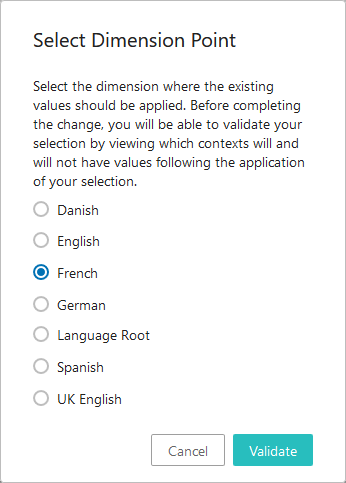
Ability to select dimension point when enabling dimension dependency
When applying dimension dependencies to attribute or List of Values (LOV) objects in either the Web UI or in workbench, users now have the option to select the dimension point where existing values should be applied.
Previously, when users would apply, for instance, a language dimension dependency to an attribute or LOV, the existing data would be applied to the highest dimension point (e.g., 'All Languages' / 'Language Root' in most cases), inheriting down to lower levels. If values had been entered in English previously, all configured languages would continue to show the English values following the update. This ensured that the existing data continued to appear in all previous locations following application of a new dimension dependency. However, the purpose for applying a dimension dependency is typically to allow unique values to exist on the same attribute in different dimension points. Therefore, displaying English values in, for example, the French, Danish, and Dutch contexts was not the desired outcome, and would necessitate a user removing values from those contexts using a cumbersome export / import process.
By enabling users to select a specific dimension point to which existing data will be applied, the system now better supports the standard use case of differing data by dimension point, allowing users to apply the existing values only to the dimension point to which they are relevant. If more than one dimension point needs data applied to it, users can apply the data to the selected dimension point, export, and then import to all needed dimension points. Users who wish to utilize the previous functionality can apply the existing values to the highest dimension point.
Once the user has selected the dimension point to which existing values should be applied, the system validates the selection against the available contexts and displays a popup containing a list of all contexts that will have values following the change, as well as those that will not.
In order to support the selection interface and validation, it is no longer possible to add multiple dimension dependencies in one action. Attempting to do so displays an error prompting the user to add them individually.
For more information on dimension dependent attributes, see the Dimension Dependent Attributes topic in the System Setup / Super User documentation here.
Data Container Table View Editor size is now configurable
Column widths and row heights in the Data Container Table View Editor component can now be configured either manually or via two new designer settings.
Previously, the dimensions of the data container table were locked and could not be adjusted, resulting in instances where some cell data could not be seen in its entirety. Now, users can configure the table to better display data by setting values for the new 'Preferred Row Height' and 'Preferred Column Width' designer settings, or by manually adjusting height and width to determine how the table displays in the current session.
This update helps ensure all relevant information in data containers can be viewed in the Data Container Table View Editor. For more information on the Data Container Table View Editor component, please see the Data Container Table View Editor topic in the Web User Interfaces / Web UI Getting Started documentation here.
New date picker available in Advanced Search
The Advanced Search screen functionality is now updated to allow users to more easily search for objects based on attributes with a Date, ISO Date, or ISO Date and Time validation base type. Once a user has selected an attribute with one of these validation base types, a calendar button is accessible. When clicked, a date picker displays that enables users to select one or more date values relevant to the search request.
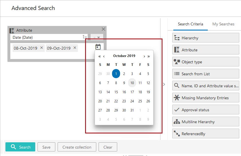
Through use of the date picker, users no longer have to determine which date format is correct prior to executing a search. The system does this automatically by populating the chosen date into the search field in the correct format. Additionally, the search field still allows users to enter free-text date values.
For more information on the Advanced Search functionality in the Web UI, see the Advanced Search topic in the Web User Interfaces / Web UI Getting Started documentation here.
Dynamic sizing for input fields
Dynamic sizing of input fields has been introduced in the Web UI. Following an improvement added with the 9.1 release, some customers experienced issues with unnecessary scroll bars displaying in the Web UI. Dynamic sizing solves this issue by enabling the UI layout to react to size changes in a more responsive way.
Edit metadata on Product to Classification links in Web UI tables
The 'Target or Reference Metadata Value Header' component available for Node Lists in the Web UI now displays and enables editing of metadata on Product to Classification links, giving designers expanded flexibility to show as much relevant data as possible when designing tables in the Web UI. Previously, the 'Target or Reference Metadata Value Header' could display metadata on reference types, but not link types.
As with reference types, this update is restricted to Product to Classification link types that do not allow multiple targets (i.e., the 'Allow multiple links' setting for the reference type is set to 'No').
For more information on Node Lists, see the Node List Component topic in the Web User Interfaces / Web UI Getting Started documentation here.
Execution report errors configurable
The number of errors that display in background processes (BGPs) is now configurable.
Previously, the hard-coded maximum number of errors that could display in the execution report section of a BGP was 1,001. Now, users can add two properties to the sharedconfig.properties file to display a user-set maximum number of errors. The Import.TotalErrorReportLimit property allows users to set a new maximum number of errors that display in a BGP. The IntegrationEndpoint.ErrorLogExcerptsLimit property enables users to set a maximum number of errors that display, per BGP, in the 'Error Log Excerpts' tab on integration endpoints. By default, this tab displays the first 10 errors for each of the last 100 BGPs initiated from that endpoint.
It should be noted that this change only affects the number of errors visible in the execution report. The numeric total of errors generated in a BGP will always display, regardless of these settings. Additionally, info and warning messages are not affected by this change.
When configuring these properties, users should be advised that setting a new maximum significantly higher than 1,000 could result in performance slowdowns when running certain BGPs.
Image display on classifications and entities on Node Lists
Image thumbnails are now enabled for display on classification and entity objects on Node List screens in the Web UI.
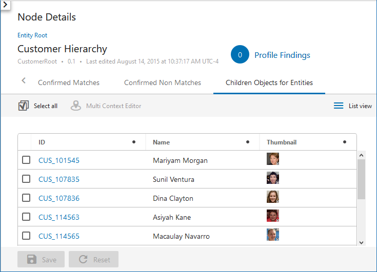
Previously, images linked to classification or entity objects on Node List screens would not display, regardless of configuration, showing only a folder icon for classifications and no image at all for entities. Now, all display modes have the capability of showing images for classifications and entities in the same way that they do for products. Using the Gallery and Film Strip display modes, this means that the primary image is automatically displayed, unless an alternate asset reference type is configured. For all other display modes, the Thumbnail Header is used to show images, which automatically displays the primary image.
Users who upgrade to 9.3 and would like to see thumbnail images display for these super types when viewed in Node Lists must add the required classification and entity object types as valid source objects on the Primary Product Image reference type (or other configured image reference type).
For more information on Node Lists, see the Node List Component topic in the Web User Interfaces / Web UI Getting Started documentation here.
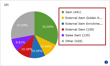
KPI homepage widget text display update
The KPI Widget has been updated to ensure the legend text that displays to the right of the pie chart fills more of the available space in the widget. Previously, the legend text truncated to an ellipsis even though additional space was available to display more characters.
For more information on the KPI widget, see the Data Profile Widgets in Web UI topic in the Web User Interfaces / Web UI Getting Started documentation here.
New filtering option for Web UI tables
A new filtering option called 'Is one of' has been made available for Web UI tables. This option is available on Node List screens for all headers, but may best be used with the 'Name,' 'ID,' 'Title,' 'Attribute Value,' and 'Attribute Value Group' headers. The 'Is one of' search operator enables users to filter a table based on a list of values in a selected column.

Multiple values separated by commas (or other accepted delimiters like semicolons, pipes, tabs, or newlines) can be pasted into the input field to the right of the operator selector, directing the system to filter results to show only those rows containing any of the entered values. If no row in the table contains a value exactly matching at least one of the pasted values, no results will display.
This operator is best used in instances when the user wants to work with a subset of objects for which certain values are known, often the object's ID. These values, copied from an Excel spreadsheet or other source, are then pasted into the filter to obtain the desired subset of objects.
For more information on filtering in the Web UI, see the Node List Component topic in the Web User Interfaces / Web UI Getting Started documentation here.
New Task List header displays object's time spent in workflow state
A new header called 'Duration in Workflow State Header' is now available for configuration on Task List screens.

When added, this header displays how long each object has spent in the current workflow state. Previously, users could configure their Task List screens to display whether an object had been in a workflow state past a configured deadline. However, this could result in a large number of tasks showing as 'past deadline,' which did not always provide the right level of detail required to clear the most urgent workflow tasks from the queue. With the 'Duration in Workflow State Header,' users can sort the Task List so the oldest tasks display at the top, giving users a powerful tool to more effectively manage their workflows.
For more information on Task Lists, see the Task List topic in the Web User Interfaces / Web UI Getting Started documentation here.
Object focus in the Tree stays consistent
Focus on a selected node in the Tree Navigator will now persist without shifting to a different instance of that object elsewhere in the Tree Navigator.
Because the system highlights all instances of a given object in a Tree Navigator when any one instance of that object is selected, the system would sometimes shift focus to a different instance of the object, causing the user's view of the Tree Navigator to change. As an example, if users selected an object in the yellow hierarchy, then the system would shift focus, in the Tree, to the instance of that same object in the blue hierarchy. This behavior was unhelpful in many instances.
It is important to note that this update will not affect the system's current default behavior of highlighting all instances of an object wherever present in a Tree Navigator. The difference introduced with this change is that now users will have to scroll to see those additional instances; the object the user has selected will remain the focus even if other instances of the object are located elsewhere.
For more information on the Tree Navigator component, please see the Tree Navigator Component topic in the Web User Interfaces / Web UI Getting Started documentation here.
Update to the Business Action with Web UI Bind component
A new configuration option has been added to the Business Action with Web UI Bind component when configured on Node Lists that allows an administrator to set the maximum number of nodes upon which the Business Action with Web UI Bind button can be run. Previously, no restrictions could be set, which could result in performance issues if a component was configured with a highly complex business action and then applied to a large selection.
The new parameter, 'Max Number of Nodes,' is mandatory and requires an administrator to set the value when configuring the component. If the user selects more nodes than the configured 'Max Number of Nodes' parameter allows, the Business Action with Web UI Bind button is disabled. If the user selects the maximum number of allowed nodes or fewer, then the button is enabled. It is recommended that, subject to customer requirements and system resources, Business Action with Web UI Bind components configured with a high level of complexity should set the maximum number of nodes to less than 50, while low-complexity instances of the component may set the maximum to more than 50.
When updating to 9.3, it is important to note that end users working on screens with the Business Action with Web UI Bind component already configured will experience no change in performance aside from a new system default restricting node selections to no more than 50. However, when admin users access the designer for those screens, the designer will display as being in error and disallow configuration changes until the error is cleared. Additionally, the field for the 'Max Number of Nodes' parameter will be blank: the default maximum of 50 is applied by the system. To clear the error, designers must manually add a value to the new 'Max Number of Nodes' parameter in all Business Action with Web UI Bind components configured for the screen.
For more information on the Business Action with Web UI Bind component, see the Business Action with Web UI Bind topic in the Web User Interfaces / Web UI Getting Started documentation here.
Changes to validation functionality
Changes have been made in three places with respect to validation-related functionality. As business conditions meet validation requirements more efficiently than some existing Web UI functionality, the following changes have been made for the 9.3 release:
- The 'External Validator' parameter, found on the 'Attribute Value Component Properties' screen in the designer, has been removed.
- The 'Post Save Validation Script' parameter which was available on a number of screens, like Node Details, BGP Details, etc., has been removed.
- The 'Run Server Script Action' component has been superseded.
With this update, the 'External Validator' and 'Post Save Validation Script' parameters have been removed and will not be seen when adding new components upon which the parameters were previously available. If the removed parameters (which display with a gray background to indicate they have been withdrawn) are shown on active components configured in your Web UI, those parameters will remain until the content added for those parameters is removed and the designer is saved. Once removed and saved, the parameters will not display the next time the components are accessed in the designer.
The superseded 'Run Server Script Action' component will continue to display in the 'Add component' window, but will now show with a gray background and a note in the description about using the 'Business Action with Web UI Bind' component instead of the 'Run Server Script Action.' If already configured on a system, the 'Run Server Script Action' component will continue to work as configured following an update to 9.3. The 'Run Server Script Action' component is scheduled to be removed in a future release.
Update to the Golden Record Linked Members Component
Three new parameters have been added to the Golden Record Linked Members component in Web UI: Use Immediate Save, Dimensions, and Enable Freeze Panes. Enabling 'Use Immediate Save' will prompt a save every time an edit is made to data within the component. The 'Dimensions' parameter allows users to tweak the default display length / width of the rows and columns of the grid. The 'Freeze Panes' action button allows users to freeze the selected columns / rows for streamlined navigation of the table.
Together, these three parameters enhance the usability of the component and align it with standard table component functionality across the Web UI.
For more information, see the Golden Record Linked Members Component section of the Web User Interfaces / Web UI documentation here.