Web UI Enhancements
Summary
Enhancements and changes to the Web UI for the 9.2 release include:
- A new Multi Context Edit toolbar action allows users to view and edit product details for one or more objects in multiple contexts in the same view.
- New summary card component displays important object data for products, entities, assets, and classifications at the top of Node Details screens.
- Views of data in the Web UI, including tab, view, and highlighted attribute, can now be shared via URLs through the implementation of deep linking.
- Tabs and sub screen tabs can now be configured to display based on the outcome of a business condition.
- Screens can now be mapped based on the outcome of a business condition.
- The ordering of confirmation ('OK') and dismissal ('Cancel') buttons have been switched throughout the Web UI, and dialog buttons now align with the primary (shaded) and secondary (unshaded) button handling established by Material Design.
- The Workflow State component is now the Workflow States component, and has been updated for ease of use.
- The File Loading Widget can now be set to record the Web UI user as the IIEP initiator rather than the configured IIEP user.
- Business Action with Web UI Bind component can now be configured to accept user input via attribute-validated parameters and/or a node picker.
- The Assign toolbar action now lists selectable workflow task assignees in alphabetical order.
- The Node Picker Search tab for the Add Reference component can now be configured with headers and search plugins for more detailed searches.
- Orphan attributes are now visually indicated in the Web UI.
- Pop-up dialogs that display based on a click or hover-over actions now end display based on the same action that initiated display.
- The Node Picker in the 'Move Action' component now displays items in the hierarchy with both their name and ID.
- Web UI navigation has been improved when a user cancels out of an object creation task using the 'Create Object' action.
- The Alternate Node Appearance component now enables display of the visual indicator (colored dot) beside configured objects in the Global Header Search results.
- A new parameter has been added to the Tree Navigator to allow all leaf objects to display by default.
- The Children of Type screen has been superseded (as previously announced) and users should move to using Children of Types screens prior to the next feature release.
- Quicksheets are no longer supported and their corresponding actions have been removed.
Details
New tool for analyzing and editing data in multiple contexts
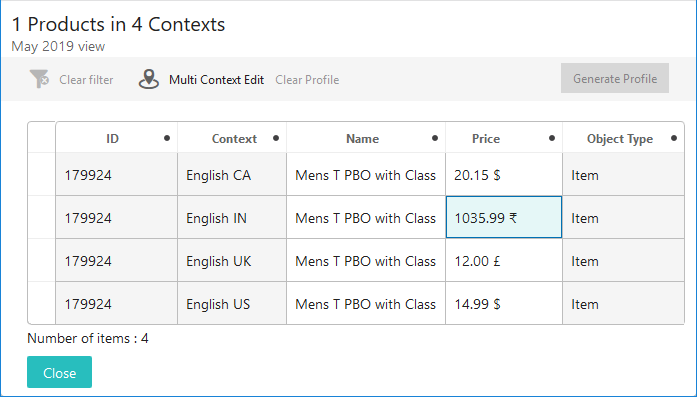
A new Web UI toolbar action (Multi Context Edit) for Node Lists enables users to see more information about product data for multiple products in multiple contexts. Once users select the objects that will be part of a multi-context view, clicking the Multi Context Edit toolbar action affords users a view of those objects with one listing for each item in each of the selected contexts. Information specific to that object and context shows for each of the configured data columns. In the screenshot below, multiple instances of the product '179924' are listed, once for each chosen context. A price relevant to the product in each of the configured contexts is shown.
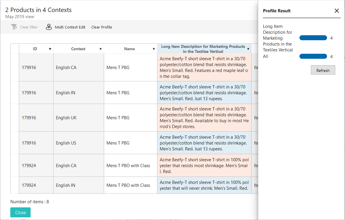
One of the key aspects of this feature is the ability to quickly analyze, or 'profile', attribute data as it pertains to multiple products in multiple contexts. An example of profiled data is shown in the screenshot below. To profile data using this feature, a user must first select the columns to be profiled by clicking on the desired column headers. Clicking the 'Generate Profile' button directs the system to create a graphical display of how many attributes' values are localized for the selected columns. Attribute values that meet this criteria are shaded red for quick identification.
An example of how profiling could be applied is when a customer wants to review marketing content across multiple contexts covering a series of products. When a product description attribute column, for example, is profiled, users can quickly see which marketing copy was made local for the context via the red-shaded cells. Further review can determine which content is compliant with marketing standards, and which may need additional review. Clicking on the profile metric in the 'Profile Result' section (located to the right in the screenshot below) will filter the column so only the rows with red-shaded cells will display.
The views for this feature incorporate the user configurable view functionality, which means that the same process used to create and configure views when applying a view is used with the Multi Context Edit component.
It should be noted that selecting a large number of objects coupled with a large number of contexts can create performance issues when rendering. The system gives admins the ability to display a warning when the number of nodes selected exceeds a configured maximum by adding the property MultiContextEdit.RecommendedMaximumNumberOfNodes=1000 in the sharedconfig.properties file. This property directs the system to display a warning message to the user if more than 1,000 nodes (a combination of objects and contexts) are set to display in the Multi Context Edit component. The '=1000' is the maximum that aligns with Stibo Systems' recommended practices, but can be set higher or lower, depending on customer requirements.
To use the Multi Context Edit toolbar action, contact your Stibo Systems account manager or partner manager to activate the 'multi-context-edit' component.
For more information on the Multi Context Edit toolbar action, see the Multi Context Edit Component topic in the Web User Interfaces documentation here.
New summary card component displays important object data for products, entities, assets, and classifications at the top of Node Details screens
A new component called 'Summary Cards' enables users to display a grouping of an object's primary data points at the top of a Node Details screen. These Summary Cards have been made available for products, assets, entities, and classifications. Available as an option in the 'Below Title' parameter in a Node Details' child components, Summary Cards display card content just below the screen title. By grouping information in this way, users can easily locate the name, ID, approval status, and any other pertinent attribute value or data container attribute values specific to the object being worked on.
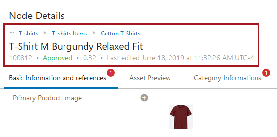
Two card options are available when applying a Summary Card component to an object information screen: 'Description Card' and 'Attribute Card'. When 'Description Card' is selected, a series of baseline data points about the object will automatically display just below the screen name, like breadcrumb info, name, ID, and time / date information related to when the object was last updated. The screenshot above shows an example of a 'Description Card'.
When 'Attribute Card' is selected, users can configure the card to display which attribute values or data container attribute values should display in the area just below the screen name. Users can select one or multiple attributes or data container attributes to display. As long as all selected attributes and data container attributes are valid for the object's object type, they will display below the screen title.
For implementations in which data profiling is configured, a 'Secondary' card that displays preconfigured metrics can be added to either a 'Description Card' or 'Attribute Card'. This feature is applicable to all summary card components except the Asset Summary Card as assets cannot be profiled.
Additionally, the Entity Summary component has been superseded by the Entity Summary Card component. Those with Entity Summary components already configured will see no changes when updating to 9.2. However, when adding new summary components, the Entity Summary will display in the component list as superseded and Stibo Systems' recommended practice is to use the Entity Summary Card going forward.
For more information on summary cards, see the Below Title Component topic in the Web User Interfaces documentation here.
New support for deep linking, browser navigation, and retention of on-screen selections when navigating
Deep linking has been implemented in the Web UI as part of the 9.2 release. Deep linking allows users to share granular views of data in the Web UI via URLs, enabling more effective collaboration. As an example, if a user has navigated to a Node Editor displaying data in a Multi Edit View, and then scrolls down to highlight the 'Brand Name' attribute field, the user can then copy the URL, and send it to a different, properly privileged user. When that user opens the link and logs in, they will see the same data showing in the same view as in the sender's view, and the screen will have auto-positioned to the highlighted 'Brand Name'.
Expanding the linking functionality resulted in another improvement relating to Web UI navigation. Now, when a user hits the 'Back' button in their browser, the screen to which the user returns remembers the settings, search criteria, and various other facets applied to that previous screen. As an example of this ability to 'keep state,' when a user runs a search in the Advanced Search screen, clicks on one of the objects in the search results, and then clicks the 'Back' button, the user is taken back to the search results. Previously, the user was taken back to a blank Advanced Search screen, necessitating redoing the search.
It is important to note, however, that this capability comes with some limitations. Not all possible configurations of a screen will be remembered when sharing a URL. For instance, if a user applies the Freeze Panes functionality to a Node List, a copied and pasted URL will not remember where the panes were frozen.
For more information on the limitations and considerations associated with deep linking, see the Using Web UI topic in the Web User Interfaces documentation here.
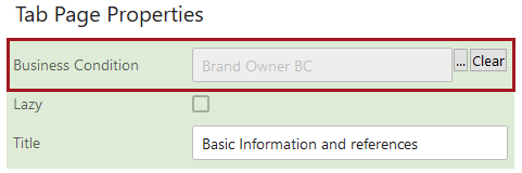
Control display of tabs with a business condition
Tab pages and sub screen tab pages in the Web UI can now be configured to display based on whether a business condition has been met. If the selected business condition returns true, the tab displays; if false, the tab is hidden. This feature can be used with an 'Attribute Value Comparison'-type business condition to determine, for example, whether a tab page containing hazmat-related attributes will display based on whether the attribute value for an attribute called 'Hazmat' is 'Yes.' As another example, this feature can be used to restrict display of tabs on objects moving through a workflow. A Task List screen containing multiple tabs can be configured to show only the tab relevant to the state in which the object resides. The business condition for tab display is evaluated when the screen is loaded or refreshed, or when the relevant data is saved. This feature can be used throughout the Web UI to restrict display of tabs to only those needed for the task at hand, reducing the potential distraction and visual clutter of unnecessary tabs and sub screen tabs.
For more information on tab pages in the Web UI, see the Tab Pages topic in the Web User Interfaces documentation here. For more information on configuring business conditions, see the Business Conditions topic in the Business Rules documentation here.
Screen mapping via a business condition
Screen mapping conditions in the Web UI now allow users to map screens based on the outcome of a business condition.
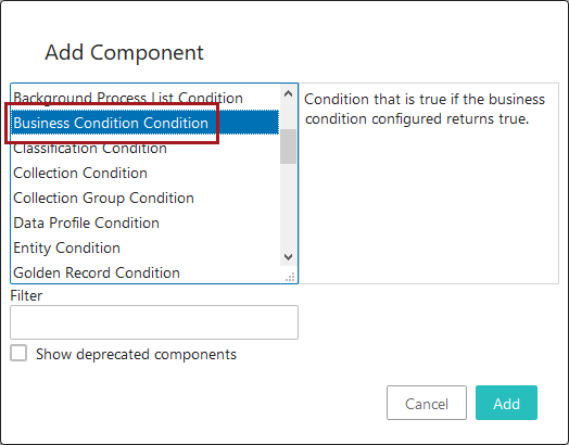
The new mapping condition, 'Business Condition Condition' can be used to set a screen mapping based on criteria described in a selected business condition. If the condition returns true, the screen mapping is used; if it returns false, the system continues to evaluate other mapping options. For example, a 'Business Condition Condition' can be used in conjunction with a Multi Node Selection Condition to allow one screen to show when multiple objects of one object type are selected in the 'Apparel' section of the hierarchy, and an entirely different screen to show when multiple objects of the same object type are selected in the 'Footwear' section.
For more information on mapping screens in the Web UI, see the Mappings topic in the Web User Interfaces documentation here.
Update to buttons in Web UI
To improve the user experience and make the Web UI more consistent with Google's design language, Material Design, updates have been made to buttons throughout the Web UI.
- Confirmation and dismissal buttons, like 'OK' and 'Cancel', respectively, are swapping positions throughout the Web UI. Not only does this change make the Web UI more consistent with Material Design, it brings the Web UI into alignment with the standard user experience on the Web.
- The checkmark and 'X' icons that often accompany the button text for confirmation and dismissal buttons have also been removed. The new button look and ordering can be seen in the screenshot below.
- Finally, to make it visually clear which dialog button should be considered primary, the confirmation button is shaded to make it more prominent, and the dismissal button is unshaded to make it less prominent. This differentiation in button shading is standard on screens throughout the Web UI (e.g., the Advanced Search screen), and this update extends this treatment to dialogs.
Workflow States component redesign and more granular configuration options
The Workflow States component, which allows users to see all workflow states in which a given object currently resides, has been redesigned for improved configurability and ease of use. The updates include these changes:
- The component has been renamed. Previously called the Workflow State component, the updated component is called Workflow States. The name change is intended to more accurately describe the component's ability to list multiple workflow states in which an object resides.
- The full text for the names of both the workflow and workflow state now display with no truncation. Previously, long labels were truncated with an ellipsis with no ability to access the full text in the Web UI. Now, regardless of the length of either the workflow title or the workflow state name, all text displays, breaking to a new line when necessary.
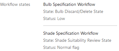
- Users can now configure which workflow states display when the object resides in it. By enabling users to select only the desired eligible workflow states, users can exclude states that are not useful to acknowledge in the component. For example, if an object is in a cluster or parallel state, it is rarely useful to notify the user of this fact as these states do not typically indicate either an actionable task or progress of an object through a workflow. Previous to this update, all states in which the object resides would have displayed, including cluster and parallel states.
For users who have one or more Workflow State components configured, a number of parameters will display but no longer have any bearing on the display of workflow states in this component following an update to 9.2. All three deprecated parameters, 'State Title Label', 'Workflow Title Label', and 'Status Flag Title Label', allowed users to configure the column headers for the display of workflow names, their states, and their status, if applicable. But because workflows, workflow states, and workflow status flags no longer display in a columnar format following this change, these parameters are no longer needed. If users go into the designer and remove the values for the deprecated parameters and save the configuration, the parameters themselves will no longer display once the user exits the designer.
For more information on the Workflow States component, see the Workflow States Component topic in the Web User Interfaces documentation here.
Improved File Loading Widget allows users to track the import BGP
When adding a file to the File Loading Widget in the Web UI, users can now track the progress of the initiated background process (BGP). A new parameter has been added in the designer called 'Swap User' that changes which user the system records as initiating a file upload via the widget. Rather than logging the user configured for the widget's Inbound Integration Endpoint (IIEP) as the file loader, the system instead records the user as the logged-in Web UI user. This allows the executing Web UI user to see information about the file processing in the Background Process Notification panel just as they are able to for other BGPs they have initiated. Previously, the user was not able to track the progress of the file import, only the progress of the file upload; no visibility into the file's processing via the IIEP was possible in the Web UI.
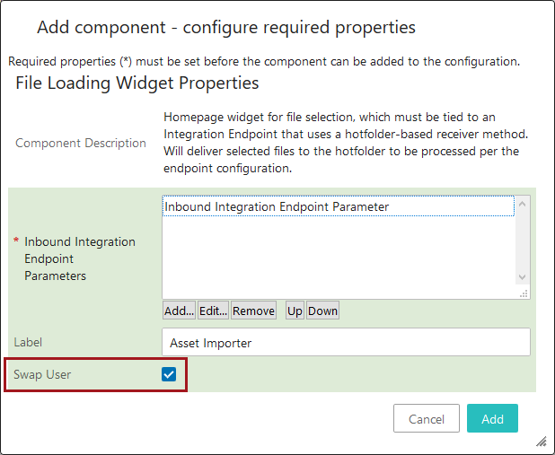
When the 'Swap User' parameter is checked, all data changes in the system will record the executing Web UI user in the revision information rather than the IIEP user. However, because the Web UI user loading the file is often more relevant for revision history than the IIEP user recorded for file uploads in system-to-system integrations, this aspect of the user swap is considered not only acceptable but often preferred.
Also note that this functionality is only applicable when the IIEP is configured to use the Web UI File Loading Receiver plugin.
For more information on the File Loading Widget, see the File Loading Widget topic in the Web User Interfaces documentation here.
Business Action with Web UI Bind can now accept user input
The Business Action with Web UI Bind component now has the option to accept user input in the form of attribute-validated parameters and/or a node picker. User-friendly input fields are displayed (e.g., dropdowns for LOVs, date pickers for dates, etc.) to enable easy data entry, and the node picker includes standard configuration options to optimize the selection process (e.g., hierarchy restriction, configurable search results table, etc). The data provided via the input fields are then available for use by the associated business action.
The screenshot below is an example of how a user input dialog might display following a click on the configured Business Action with Web UI Bind button.
Additionally, an 'Enforce Validity' parameter has been added to the Business Action with Web UI Bind component. When checked, this parameter will disable the Business Action with Web UI Bind button until all data on the screen is valid, including that all mandatory attributes are provided. The 'Enforce Validity' parameter is only applicable for this component when configured on a Node Editor.
With the 9.2 update, the Business Action with Web UI Bind component has been added to the baseline installation.
For more information on the Business Action with Web UI Bind component and examples of use cases that incorporate the user input dialog, see the Business Action with Web UI Bind Component topics in the Web User Interfaces documentation here.
Assign Toolbar Action assignees listed alphabetically
The list of valid assignees that displays when initiating the Assign Toolbar Action on a Task List screen is now shown in alphabetical order, based on the username. Previously, the ordering of usernames displayed unpredictably, making it more challenging to locate and select the right assignee from the dropdown. Now, to determine ordering, the Assign Toolbar Action keys on the first character of the 'Name' value set for the user. This results in an alphabetical display of potential assignees, making assignee selection easier. The current logged-in user and the default user group configured for the workflow always stay anchored at the top of the list for easy identification and selection.
For more information on the Assign Toolbar Action, see the Workflows in Web UI documentation here.
Add Reference Action now includes configurable search plugins and results table
The 'Add Reference Action' toolbar action now provides users with the ability to configure more detailed searches when looking for objects to reference. Headers can now be configured in the 'Search' tab for the 'Add Reference Action' Node Picker component. If, for example, a customer needs to see an attribute on an object to determine whether or not to create a reference to that object, an attribute header can be configured to display that attribute value for all search results. Standard Web UI search plugins like 'Search below' and 'Object Type Search' are also available in the Node Picker component, providing users with an added layer of configurability.
Additionally, the 'Add Reference Action' component's configuration parameters have been reorganized. Most parameters have been grouped under four collapsible / expandable sections: 'Search' (with parameters that accomplish the functionality described above), 'Duplicate', 'Create From', and 'Advanced'.
For more information on the 'Add Reference Action', see the Add Reference Action topic in the Web User Interfaces documentation here. For more information on the Node Picker component, see the Node Picker Dialog topic in the Web User Interfaces documentation here.
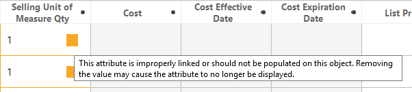
New warning for orphaned attribute values
Orphan attribute values are now visually identifiable in the Web UI. When an attribute value is orphaned, it now displays in a yellow-outlined field with warning text. Previously, orphan attribute values were not indicated visually in the Web UI.
Orphan attribute values configured on a Node Details screen show inside of a yellow-outlined field with the warning text displaying beneath the field.
Orphan attribute values configured on a Node List component display in a yellow-outlined cell with a yellow warning square. The warning text is accessible by placing the cursor over the cell.
For additional information on linking orphan attribute values see the Linking Orphan Attributes topic in the System Setup / Super User Guide documentation here.
Pop-up display behavior updates
The behavior of pop-ups that display near the point of a user-initiated action has been updated to be more intuitive, consistent, and easier for users to manage. Examples of user-prompted pop-ups would include clicking the 'Context Bar Context Selector' icon in the Corner Bar to see the menu of contexts display in a pop-up, or hovering over a truncated value in a Node List to see the full value display in a small dialog beside the relevant cell.
Now, pop-ups that display when a user places the cursor over an on-screen element can now reliably be dismissed by moving the cursor away from that element. Pop-ups that display when a user clicks an on-screen element now require a second click to end display. Previously, some hover-prompted pop-ups could not be dismissed without a click, and some click-prompted pop-ups would disappear when the cursor was moved away.
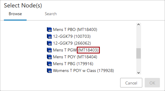
Move Action node picker now includes IDs
The Node Picker dialog that displays when initiating a Move Action now shows both the name and the ID of the objects contained in the displayed hierarchy, the ID displaying in parentheses. This change is applicable whether the Move Action was added as a toolbar action button (on a Node List), or a standard action button (on a Node Details screen). Previously, the Move Action Node Picker only displayed the name of the object, which was inconsistent with other Node Picker dialogs in the Web UI.
For more information on the Node Picker component, please see the Node Picker Dialog topic in the Web User Interfaces documentation here. For more information on the Move Action, please see Move Action entry in the Action Buttons topic, also in the Web User Interfaces documentation here.
Corrected navigation for cancelled initiations in a status selector
Object creation in workflows via the Status Selector widgets has been updated.
When a 'Create Object in Workflow' screen is configured for the 'Initiate' function on either Status Selector widget and the 'Cancel' option is clicked immediately following a click on 'Initiate', the Web UI now auto-navigates the user back to the previous screen. Previously, a blank screen would display following a 'Cancel' action, requiring users to manually navigate to the desired screen.
For more information on using the 'Create Object in Workflow' screen, see the Bypassing the Initiate Item Screen topic in the Workflows in Web UI documentation here.
Alternate Node Appearance indicators now display in Global Header Search
The display of colored dots beside objects enabled by the Alternate Node Appearance component has expanded to include objects appearing in typeahead search results for the Global Header Search component.
Previously, the colored dots would only display beside objects in the Tree Navigator, as well as the 'Browse' and 'Search' tabs in a Node Picker dialog.
For more information on the Alternate Node Appearance component, see the Tree Navigator Component topic in the Web User Interfaces documentation here. For more information on the Global Header Search component, see the Global Header Search Component topic in the Web User Interfaces documentation here
Parameter change for showing leaf nodes in hierarchies
A new parameter called 'Hide All Leaves' has been added to the Tree Navigator component (on Stack Panels and Primary Navigation Panels). When this parameter is disabled (the default setting), all leaf objects will display in a Tree Navigator component. When enabled, the 'Hide All Leaves' parameter will hide all leaf objects of any super type wherever they appear in a Tree Navigator component.
Displaying all leaf objects is a change in default behavior. If using either the 'Show Leaves' or 'Show Classification Leaves' parameters, validation should be done following an upgrade to verify the Tree Navigator displays as expected.
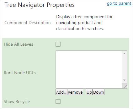
With this update, the 'Show Classification Leaves' parameter (formerly the 'Show Leaves' parameter, renamed in 9.1-MP3) has been withdrawn and will not be seen if adding a new Tree Navigator component. If the 'Show Classification Leaves' parameter (displayed with a gray background to indicate it has been withdrawn) is shown on an active Tree Navigator component configured in your Web UI, it will remain until the setting is enabled or disabled. Once changed, the setting for 'Show Classification Leaves' is disregarded in favor of the 'Hide All Leaves' setting, and 'Show Classification Leaves' will not display the next time the Tree Navigator Properties is accessed.
Children of Type Screen withdrawal and parameter update
Users should be aware that, as announced in the 9.0 New and Improved Web UI Functionality release note, the Children of Type screen is to be withdrawn. It has been superseded and will be removed in the 9.3 release. If using this screen now, customers should configure and use the Children of Types screen instead.
Although now superseded, if using the Children of Type screen, customers should note that the 'New Item Object Type' parameter was withdrawn with the 9.1-MP4 release. It was nonfunctional. However, if it was already configured, it will display in the Properties screen with a gray background. Once the parameter is changed, it will not display the next time the Children of Type Properties is accessed.
Quicksheet component removal
With the removal of Quicksheet functionality, the following action buttons are no longer available in Web UI: QuickSheet Action, Excel Export Action, and Excel Export All Action. These were withdrawn during the 9.0 release cycle, meaning that if configured on your system, they could still be used (just not added as new buttons). Now, they will not appear in any 9.2 system.