Web UI Enhancements
Summary
Enhancements to the Web UI for the STEP 9.1 release include user experience improvements to screens and processes, revised error messaging, and updated visual indicators. There are also new / updated components and screens.
Customers using custom CSS in Web UI should also be aware of changes to Stibo Systems' custom CSS policy. Before upgrading to STEP 9.1, these customers must contact Stibo Systems. See the 'Updated policy regarding custom CSS' section of this release note for more information.
Details
Web UI visual update
The STEP Web UI has been updated with a series of visual improvements designed to make the Web UI faster, more intuitive to use, and simpler to navigate. Listed below are some of the changes:
- The font used throughout the Web UI, Arial, has been changed to the system font native to the user's operating system: Segoe UI for Windows operating systems, and San Francisco for Mac operating systems, as examples. This change improves alpha-numeric readability throughout the Web UI, provides better support for localization, and enhances the Web UI's performance.
- 'Semantic' colors have been implemented consistently throughout the Web UI. 'Semantic' in this context refers to how different colors and gradations of color are applied to various web elements like buttons and homepage widgets. Minor differences in color can convey a variety of meanings the user will perceive intuitively. For instance, on the Advanced Search screen (pictured below), a primary button and secondary buttons display together.
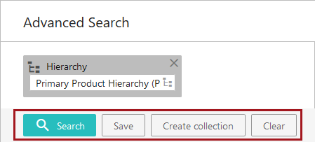
The secondary buttons, 'Save', 'Create collection', and 'Clear', are without color, which makes them recede into the background. The primary button, in this case 'Search,' is colored turquoise by default, which makes it stand out. When there are multiple buttons to choose from, this variation is intended to direct the user's eye to the button they are most likely to use. The color of the primary button is determined by 'Accent' in the designer's 'Web UI style' tab. The secondary buttons are unaffected by the colors selected.
- When a user places the cursor over a primary button on a Web UI screen, the button will transition from the darker shade of that color to a lighter shade. When the cursor is placed over a secondary button, the gray outline and text of the button turns black. These transitions help signal to the user that the buttons are activated. Applying the use of semantics to the UI in this way enhances the UI's ease of use, and makes it more clear to the user which action to take next.
Business Action with Web UI Bind component
The Business Action with Web UI Bind component is a highly configurable feature that provides additional flexibility in how users can navigate through and complete tasks in the Web UI. By incorporating custom business actions, this component can be applied in multiple scenarios, as either a Toolbar Action button on a Node List or a standard action button on a Node Details screen, to help make the experience of using the Web UI faster and more intuitive for the end user.
Through the use of a new global JavaScript bind called 'Web UI Context' that enables business actions in the Web UI, the Business Action with Web UI Bind component greatly expands what is possible in the Web UI. For example, the bind gives access to a set of handles that can be used to show popup notifications with custom messages when the Business Action with Web UI Bind button is clicked.
As one example of how this component can be applied to the Web UI, prior to the implementation of this component, if a user wanted to submit an object accessed via the Tree into the next workflow state and immediately do work on it, they would have to manually navigate through a series of Web UI screens and widgets to end up on the desired screen. In this instance, the user might expect to be auto-navigated to the screen where work can be done. The Business Action with Web UI Bind component can be configured to address this challenge by auto-navigating the user directly to the relevant screen upon initiation into a workflow.
To access the Business Action with Web UI Bind component, a ‘webui-businessrules’ add-on component must be activated on your system in addition to the normal update procedures. See your Stibo Systems representative for more information.
For more information on the Business Action with Web UI Bind component and the use case described above, see the Business Action with Web UI Bind topics in the Web User Interfaces documentation here.
New default Tab Page designation
It is common for an object in Web UI to have many different types of tab pages, each holding relevant grouped information, but not all of these may be relevant for a particular task. It is now possible to configure different default tab pages to display for an object using business functions. These business functions can use workflow and state IDs to determine which tabs to display, and/or they can use attribute values to determine what tabs to display. This enables users to immediately see the tab with the most relevant information to their task and cuts out additional navigation steps.
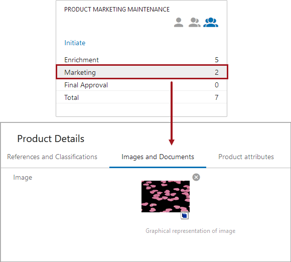
For example, a user working in a particular workflow selects an object in the second state of the workflow. The second tab is most relevant for this state's needed task, which is ensuring that the image associated with the object is suitable for marketing purposes, so this tab is configured to be the default tab to open. This is more efficient for the user, saving them valuable time.
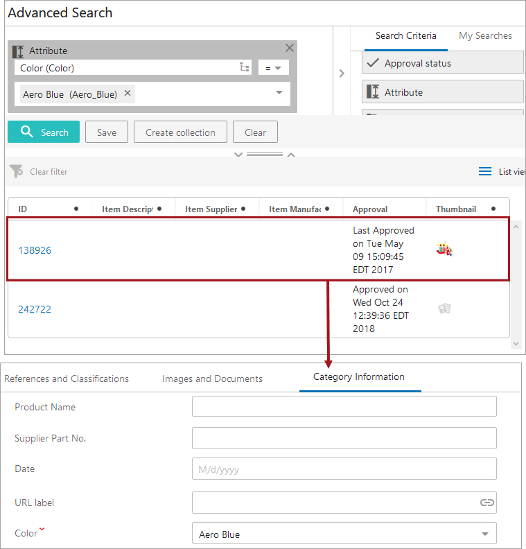
Alternatively, a different user not working in any workflow, needs to update an object that happens to have an attribute value of 'Aero Blue' for the color. The business function has been configured to return the third tab for any object that has an attribute value of 'Aero Blue.' In this case, the user uses an Advanced Search to find the object, and upon clicking the object, is brought to the third tab.
To configure default tab pages based on workflow and state IDs and/or an attribute value, set up needs to be done in the workbench and in Web UI. See the Designating a Default Tab topic in the Node Details Component section of the Web User Interface / Web UI Setup and User Guide documentation here.
Improved messaging in the Web UI
The way system messages are communicated to the user has been updated to enhance clarity, consistency, and relevance. Whether the notification is informing the user about an error, a potential error, or some pertinent information about a process that has completed, these improvements are intended to make system messages not only more informational, but more instructive about a user's next steps.
- In an effort to make system-generated Web UI messages visually meaningful, notifications have been broken into four categories: Errors, Warnings, Acknowledgments, and Information.
Dependent on the kind of message the system displays, system notifications are now accompanied by a color that visually conveys its message category. By classifying and color-coding notifications, users will know right away what kind of notification is being surfaced when a message displays, enabling users to respond quickly and effectively.
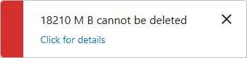
- Error notifications are red. These display when a user-attempted action cannot be completed.
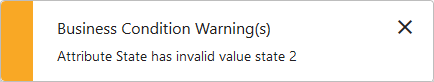
- Warning notifications are yellow. These display when a user-attempted action can proceed, but aspects of the request may require additional caution.
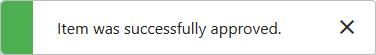
- Acknowledgment notifications are green. These display when a user-prompted action has completed.
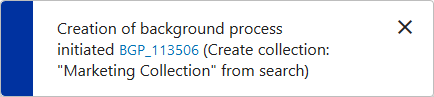
- Informational notifications are blue. These display when a system action or process has begun or when it has completed.
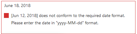
- A significant percentage of error messages have had their wording updated to provide users with actionable information about the error. Previously, many error messages only stated the nature of the error, without always communicating why the error occurred or potential next steps the user might take to resolve that error. Now, system-generated error messages indicate not only what the error is, but also why it occurred and information on how a user can correct the error. In the error message example shown below, a date value has been entered that does not conform to the configured format. This updated message clearly states what has prompted the error, as well as the step the user must take next to successfully complete the action.
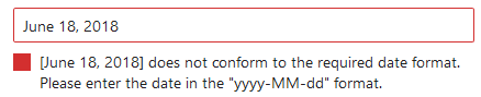
- When user-added values conflict with the configured validation base type, the warnings and errors this conflict generates now result in a colored outline around the affected fields and cells: yellow for warnings and red for errors. This helps users more quickly identify where erroring fields and cells are located on a given screen. The specifics of how the error message will display is dependent on the nature of the erroring field and how it is being viewed. For instance, an improperly formatted date error in a Node List will display as shown in the screenshot above: with the field outlined in red and the color-coded icon and error message displaying inside the affected cell. An improperly formatted date error in a Node Editor will display with the icon and message below the outlined field, as in the screenshot below.
Status Selector Task Mode updates
Admin users now have the ability to configure end user access to workflow tasks by setting which task mode icons are accessible in Status Selector widgets.
Previously, based on the user's privileges, task mode icons were visible by default in the Status Selector, giving users the ability to view more tasks than just those relevant to them, with no option to customize the user's view. Now, admin users may select which combination of icons will display for workflow users. This feature would, for example, enable an admin user to set a default that would display no icons and show a user only tasks assigned to their user group. This might be particularly useful for users who do not claim tasks as part of their workflow process as they would only need to see which tasks are assigned to their group. This level of configurability can provide a more tailored user experience for those working in workflows in the Web UI.
For more information on this update to Status Selector widgets, see the Status Selector Homepage Widget documentation here and the Status Selector Sidebar Widget documentation here.
Advanced Search screen improvements
Three enhancements have been made to improve ease of use for the Advanced Search screen in the Web UI:
- A 'Clear' button has been added that enables users to remove all search criteria added to a search with a single click. Previously, users had to delete each search term individually to clear the search area and start a new search.
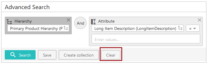
- 'Semantic' colors have been implemented on the Advanced Search screen. 'Semantic' refers to how color can be applied to web elements like buttons and homepage widgets to convey meaning the user will perceive intuitively. Applying this concept, the buttons on the Advanced Search screen have been organized into primary and secondary buttons, as shown in the screenshot above. The primary button, 'Search', is colored turquoise by default, and the secondary buttons, 'Save', 'Create collection', and 'Clear', are without color. This variation is intended to direct the user's eye to the button they are most likely to use.
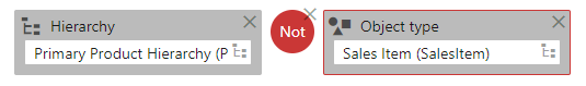
- Text-based search conditions are now fully implemented on the Advanced Search screen. Previously, the 'Not' condition was expressed as the symbol ' ÷ '. Now, when a user wants to search, for example, the Primary Product Hierarchy but exclude 'Sales Item' object type objects from their search results, they can add a 'Not' condition between the 'Hierarchy' and 'Object Type' criteria, (as pictured below). Implementing text-based conditions in Advanced Search removes ambiguity from the search-building process, and makes the intent of a search more clear.
For more information on advanced search, see the Advanced Search section of the Web User Interfaces documentation here.
Visual indicators on inherited references
Two new visual indicators have been added to references in the Web UI that allow users to see whether references on objects are inherited from parent nodes, parent contexts, or both. Previously, users could not determine which references were local and which inherited, making it a challenge to know which references might be most relevant, or which references could easily be removed. Because this information is now provided on the reference in a clear and visual way, users can now quickly see where their references originate and make more informed decisions about how best to manage them.
The new visual indicators on references display to the right of the label under the 'Reference Type' header (when configured on a Multi-Reference editor), and to the far right of a row on a References component (configured within a Node Editor).
- A green arrow displays on references inherited from a parent node.
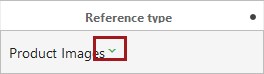
- A red arrow displays on references inherited from a parent context.
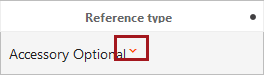
- An example of how an arrow displays on a reference using the References component in a Node Editor. In this example, a green arrow indicates inheritance from a parent node.
For more information on inheritance as it applies to references, see the Inheritance Example for a Reference topic in the System Setup / Super User Guide documentation here. For more information on adding and maintaining references in the Web UI, see the Multi-Reference Editor topic in the Web User Interfaces documentation here.
Improved reference creation process in Web UI
The process of creating references in the Web UI has been enhanced to make it simpler and more intuitive.
When creating a new reference using the Reference component or by clicking the 'Add Reference' toolbar action in the Multi-Reference editor, invalid objects will now display as grayed out. For example, objects that are either not valid for the selected reference type, or objects that have already been referenced by the chosen object, will now display in gray text to indicate the object is not valid or selectable. This enhancement is intended to show in a clear, visual way which objects are valid for a reference and can be selected, and which are invalid and cannot.
To further improve clarity in the reference creation process, a green checkmark now displays in the Node Selector popup beside objects that have already been referenced. This has been added to help prevent users from attempting to create duplicate references.
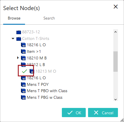
Prior to these updates, all objects displayed as valid in the Node Selector when creating a reference, including objects that had already been referenced. If the user attempted to create a duplicate reference, the system raised an error only after the user had completed the attempt. This could lead to a frustrating reference-creation process. Now, in addition to clearly identifying invalid selections, the Web UI also displays an error message as soon as the user selects an invalid object.
With the addition of these changes to the reference creation process, users can now easily see which objects are available to create new references.
For more information on adding references in the Web UI, see the Multi-Reference Editor topic in the Web User Interfaces documentation here.
Bulk Update Template Action improvement
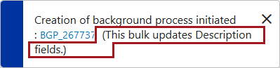
The 'Bulk Update Template Action' now allows users to configure a message that displays when a bulk update background process is initiated. Bringing the 'Bulk Update Template Action' in line with existing configurability on the 'Bulk Update' and 'Bulk Update List Actions', the 'Bulk Update Template Action' now also includes the 'Process Description' parameter.

This parameter allows users to include a customized description to the background process notification that displays following initiation of a bulk update process. For instance, the value added to the 'Process Description' parameter shown above would result in a background process notification message that displays like this:
This added layer of configurability gives admin users another tool to make background process descriptions more meaningful to the user.
Automatic display of top object details on Node Lists
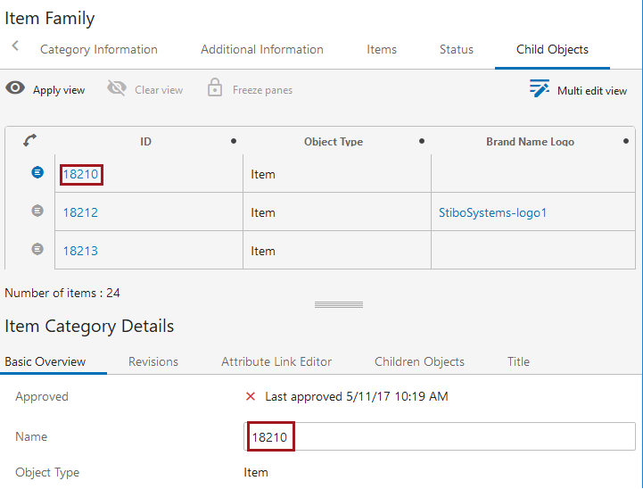
Node Lists now feature a setting called 'Show Top Item Details on Load'. This setting, configurable on the Multi Edit, Compare, and Table Display Modes, enables automatic display of a Node List's first object's details when the screen loads. Previously, Node Lists with the Show Details setting activated required users to click an object's details icon to trigger display of that object's details in the Show Details screen. In the screenshot below, the first item in the Node List, a product named '18210', displays with its details in the Show Details screen below.
It should be noted that, for this new parameter to be effective, either a mapping must be created for display of objects in the Web UI, or the relevant Node List must have a screen configured under the 'Selection Screens' dropdown in which the relevant object's details will display.
For more information on Node Lists, see the Node List Component topic in the Web User Interfaces documentation here.
Object creation improvements
Two new toolbar action components for Node Lists are now available that enable simplified duplication of existing products.
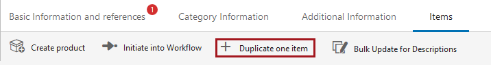
- 'Duplicate Item Action' enables users to quickly duplicate a single item in a Node List that is part of a Display Children screen or a Children of Types screen. Using this toolbar action, users can select a product displaying on a Node List in a tabular view style and duplicate it. The duplicated item is added to the same parent node as the original and retains all of the original item's information, including references.
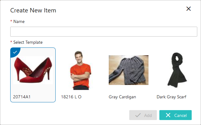
- 'Create from Template' allows users to configure product-based templates that can be used to create new products. When one or more templates have been created, users can click on the new 'Create from Template' toolbar action to create a new product. A 'Create New Item' window displays with a series of template options, each indicated by an image. Once created and a new name assigned, the selected template's attributes, attribute values, and references are applied to the new product. The component allows users to configure object type and placement in the hierarchy to be different than the product the template is based on by application of additional configuration when setting up the template.
For more information on these toolbar action buttons, see the Action Buttons topic in the Web User Interfaces documentation here.
Localization of LOVs on the List of Values Management screen
In an effort to further expand the user's ability to manage Lists of Values (LOVs) in the Web UI, values in dimension-dependent LOVs can now be added, edited, and maintained for all contexts in the LOV Management screen. As previously announced with the 9.0 MP1 release, this improvement in functionality is designed to further enable important setup tasks to be completed in the Web UI.
When viewing the updated 'Values' tab on the LOV Management screen, users can now view all of an LOV's values in the current context and in one additional context, selection of which is controlled by the user via a dropdown, indicated by a red box in the screenshot below.
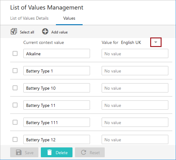
Previously, users could only edit LOV values in different contexts by changing the current context. Now, users can more easily complete their LOV management tasks in the Web UI, including bringing in translated LOV values for multiple languages in multiple contexts.
It is important to note that if an LOV has more than 5,000 values, those values will not display on the 'Values' tab.
For more information on managing Lists of Values in the Web UI, see the List of Values Management Screen section of the Web User Interfaces documentation here.
Configurable 'Search' tab in Node Picker
The 'Search' tab in the Node Picker window now enables customization of the tab's title. To support business cases in which multiple 'Search' tabs are required in a single Node Picker window, the Web UI now enables admin users to establish a clear distinction between those tabs via the title parameter.
Icon improvements for Packaging screen
Two improvements have been made to how graphical packaging hierarchy elements display on the Packaging screen.
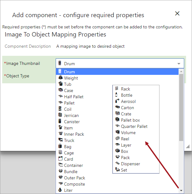
- The number of Image Thumbnail icons available to display on the Packaging screen has increased from 12 icons to 34. This gives the admin user more options when working to build out a visually meaningful packaging hierarchy in the Web UI.
- The icon thumbnails now display alongside the icon title in the configuration dropdown in the designer. This allows users to see the icon that will be added at the moment the selection is made. Previously, the appearance of the icon was not known until after the configuration was completed.
For more information on configuring and using the Packaging Hierarchy Editor on the Packaging screen in the Web UI, see the Packaging Hierarchy Editor topic in the Web User Interfaces documentation here.
Improved display of empty states on References component
On a References component that does not contain references, a  icon now displays beside the References parameter label without the accompanying table headers that may be configured on the component. Previously, empty References components displayed not only the icon, but also all table headers configured for the component, causing a potentially cluttered screen. This enhancement was done in an effort to further streamline the visual appearance of the Web UI, and to more clearly signal to users which References components are without references.
Multi Revision Editor screen improvements
On the Multi Revision Editor component available in the Multi Revision screen, users have two new filtering options. When determining which revisions display on a Multi Revision screen, users can now filter by a range of revision numbers (i.e., '0.23-0.28'), or filter by selecting specific revision numbers the user wants to display.

For more information on the screen and filtering options, see the Multi Revision Screen topic of the Web User Interfaces documentation here.
Grouping component enhancements
The Grouping component in the Web UI has been updated so the grouped titles and fields are visually aligned. Previously, the Grouping component would clearly group the configured attributes, but the effect on a screen in which multiple groups displayed was perceived by some users as disorganized.
New Remove References component
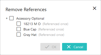
A new toolbar action called 'Remove References' is now available for Node Lists. 'Remove References' enables users to select one or multiple items in a Node List, and then remove one or multiple references from all selected items in a single action.

In the same way that the 'Create References' toolbar action can be used to add a reference to multiple objects at once, 'Remove References' enables users to remove a reference from multiple objects at once. When the 'Remove References' toolbar action is initiated, a window displays (as shown in the screenshot below) that gives users a list of all references for the selected objects, categorized by reference type. If the listed referenced object shows as 'Referenced once', then selecting that object and clicking 'OK' will remove that single reference from the object(s) selected in the Node List. If the listed referenced object shows as being referenced two or more times, then selecting that reference and clicking 'OK' will remove that reference from all objects selected in the Node List.
For more information on this and other toolbar actions configurable on Node Lists, see the Action Button section of the Web User Interfaces documentation here.
General improvements to display of information in Node Editors
In an effort to further streamline the display of information in the Web UI, labels, help text, and mandatory indicators in Node Editors have been modified to present a cleaner, more unified look and feel.
- Field labels now wrap. Previously, because long labels would not break to a second line, long field labels pushed the field further to the right, which could result in a disorganized UI appearance. Now, field labels break to a second line (after approximately 35+ characters), allowing the Node Editors' data fields to stay aligned from top to bottom, no matter how long the field labels.
- Also in support of label alignment, the red asterisk that indicates whether an attribute is mandatory, now displays to the left of the field label. Previously, these indicators displayed to the right of the field label, which, because of the variability allowed in label lengths, had the potential to highlight the variability of attribute labels. Now, because the asterisks are located in the same screen location no matter the length of the label, the overall look of the screen appears less cluttered.
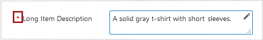
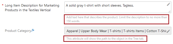
- Help text can now display beneath the field. The Web UI now supports two methods of displaying help text. By configuring the 'Context Help Display Mode' setting in the Node Editor component, users can select either the 'Display below input fields' setting, which displays all configured help text to display beneath the field, or 'Click icon to display', which makes help text accessible by clicking the help text icon to the right of the field. For implementations likely to involve Web UI users for whom constant-display of help text will be useful or, in some cases, satisfy a legal requirement, the 'Display below input fields' may be a good option. For users who are more experienced but may still need to occasionally consult help text, the 'Click icon to display' may work better. In the screenshot below, the 'Display below input fields' setting has been selected for the Node Editor. The help text displays in light gray text directly beneath the input field.
For more information on the Node Editor component upon which this setting can be configured, see the Node Editor Component topic in the Web User Interfaces documentation here.
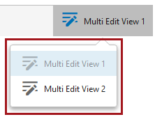
View Mode titles now customizable
Display modes on Node Lists can now be configured with a customized title. To support instances in which multiple view modes of the same type are required for one Node List, the Web UI now allows display modes to be differentiated on a single screen.
Extend functionality on Value Target Header
The Node List header component called 'Value Target Header' has been enhanced and renamed. Now called the 'Target or Reference Metadata Value Header', this component enables users to configure a header to show either the value of an attribute on a referenced target object, or the value of a metadata attribute on the reference linking the viewed object to the target object. Previously, using the 'Value Target Header' component, users could elect to display an attribute value for a referenced object, but no option existed to display a metadata attribute value from the reference. This allows users to see, at a glance, an unlimited amount of information about an object the current object is referencing, or about the reference itself, all in a single table.
This functionality also extends to user configurable views. The screenshot below shows the window that displays when a user adds a valid single-valued reference type to a user configurable view. Users can choose to display either an attribute value from the referenced object or a metadata attribute on the reference.
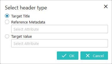
It is important to note that this feature only works with single-value reference types.
For more information on Node Lists, see the Node List Component topic in the Web User Interfaces documentation here. For more information on user configurable views, see the User Configurable Views section of the Web User Interfaces documentation here.
Enhanced Web UI label format for browser tabs
The format for the label that displays on browser tabs in which the Web UI is being viewed has been amended. When the user is viewing a screen that is not specific to an object, like the Homepage or Advanced Search screen, the browser tab will display with the name of the Web UI. When a user is viewing a specific object, like a product, entity, workflow, or workflow state (in the case of a task list), the user will see displayed in the browser tab the name of the selected object, followed by the name of the Web UI. Previously, the browser tab titles read with the text 'Web UI Application', followed by the name of the Web UI, regardless of whether an object had been selected in the Web UI. The aim of this change is to make the tab titles more meaningful for users, particularly those working with multiple Web UI tabs open in a single session. In the screenshot below, the first tab shows a browser tab in Firefox in which the user is in a non-object-specific screen. The second shows the browser tab in which the user is standing on a product called 'Black V-Neck'.

Updated policy regarding custom CSS
Custom CSS styling (Cascading Style Sheets) is a simple HTML design language applied by some customers to change a Web UI's appearance and/or behavior. While this can achieve a desired effect, it also has the potential to create impediments to the proper functioning of the Web UI, and for Stibo System's ability to support those Web UIs. With those challenges in mind, Stibo Systems now requires customers to obtain a license in order to override the Web UI's default CSS and apply their own custom CSS styling.
While this license grants customers the ability to override a Web UI's default CSS, it also requires acceptance of license terms pertinent to Stibo Systems' support of Web UIs running custom CSS:
- On systems running custom CSS, backward compatibility of Web UI functionality on any applied STEP patch cannot be guaranteed by Stibo Systems.
- Patches applied to systems with custom CSS will require full regression testing, to be undertaken by the customer, on functionality affected by the custom styling.
- Errors reported on Web UIs running custom CSS must be reproducible using default styles. Errors that cannot be reproduced with these default styles are not supported by Stibo Systems.
For information on the Unsupported CSS license, contact your Stibo Systems account manager or partner manager.
Change to data container components
Users may now save data containers even if one or more mandatory attributes are missing values. A new 'Enforce Mandatory' parameter for the Data Container Table View Editor and Data Container Attribute View Editor components is now available. By disabling this parameter, users can save data containers with missing mandatory values. Previously, all mandatory fields had to be populated before a user could save data in either data container component.
For users upgrading to 9.1 that already have data container components configured in the Web UI, this new parameter will be set to 'on' (enabled) by default and users should disable as needed. It should be noted that, regardless of the setting for 'Enforce Mandatory', data containers must have values for all mandatory attributes to be approved.
For more information on these components, see the Data Containers in Web UI topic in the Web User Interfaces documentation here.
Referenced Asset Representation customization enhancement
A new parameter has been added to the Referenced Asset Representation component that allows users to turn off display of the asset name beneath the asset thumbnail. By unchecking the setting called 'Show Asset Name', users can display a thumbnail without the asset name showing beneath it. For users who upgrade to 9.1 that already have this component configured, the new parameter will be checked by default.
For more information on this component, see the Referenced Asset Representation topic in the Web User Interfaces documentation here.
Create Tab removal from Node Picker
The 'Create Tab' component, available in the ‘Tab Pages’ parameter on the Node Picker component, has been withdrawn. The component was inoperative, so no functionality is lost with this update. Users updating to 9.1 will no longer find the ‘Create Tab’ as an available option when configuring the Node Picker component. Users with the component previously configured will see it listed in the unsupported component announcement that displays upon entering design mode and should update their configuration.
PDS (Product Data Syndication) Enhancements
Functionality connecting PDS with the Web UI is now available in Node Editors. Web UI users now have a the ability to quickly navigate to product information in PDS by clicking a link on the product in the Web UI.
For more information, see the PDS Integration Enhancements release note here.